Olivia Chapman
Graphic Designer / Textile Designer / Photographer
ABOUT
The re-brand of the UK-based fashion label Me&Thee.
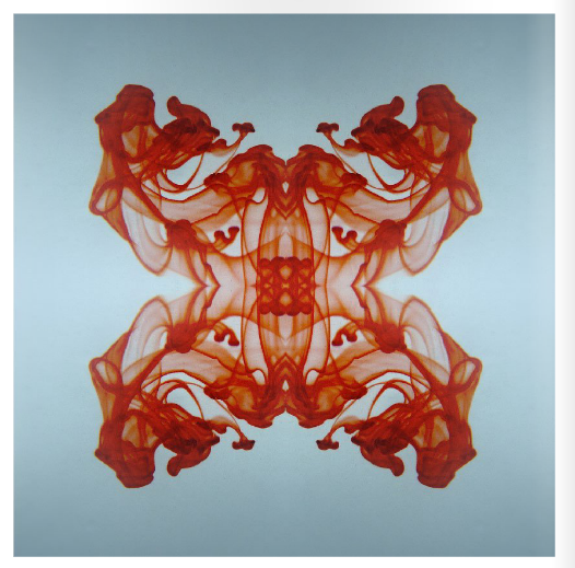
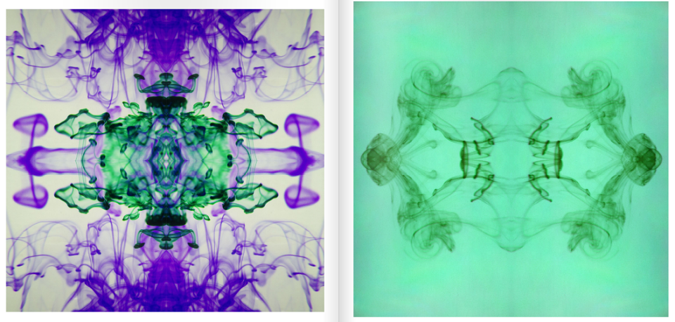
All garments are designed around kaleidoscope patterns which allowed me to experiment with
reflection and mirrored design. This was reflected through the identity using experimental photography
to represent the brands approach to their clothing.
The visual concept of reflection was also applied to the logo, fitting it with the rest of the identity and creating
a symbol that represents the companies ambitions and clothing style.
The logo has connotations of tradition and more modern sleek lettering, I felt it worked well with the brands
existing identity as I wanted to expand the market rather than aiming the brief towards a new selection of
clients.
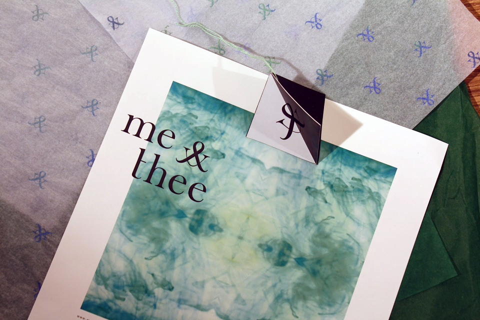
The concept of reflection was continued throughout the promotional designs, including the posters and flyers, where the ink photographs were edited to reflect the style of the brand.
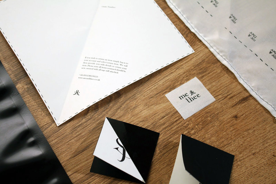
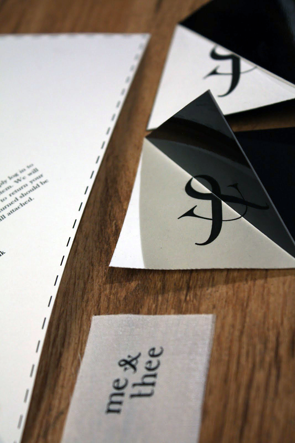
The tags and labels were kept the a minimum as I wanted to carry a sense of simplicity throughout the designs, I kept in theme with the concept of reflection and decided to use a shiny stock on folded white card with the logo printed onto, so that the logo was reflected on the shiny stock.
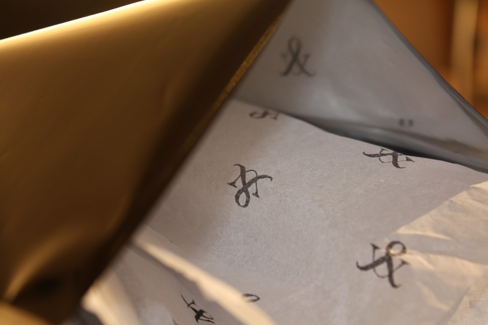
As the clothing is received though the post I wanted to complete the branding with some packaging and method of delivery options, so i created a repeated pattern of the logo which I screen printed onto tissue paper and they came out pretty well and created a feeling of sophistication, although it was a challenge printing on such delicate stock.
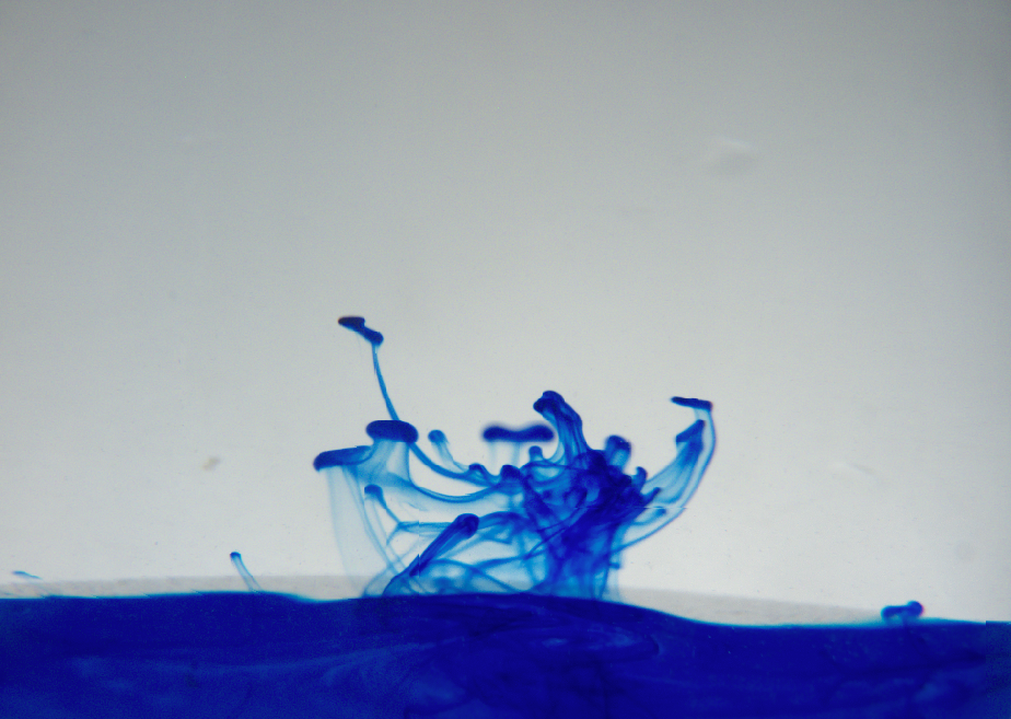
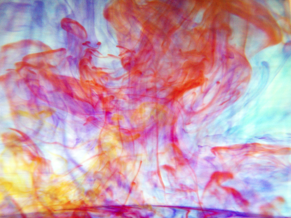
I wanted to apply photography to the brief in order to have some imagery to apply to the designs.
Working with coloured inks in water connotes the idea of pigments and dyes which relate back to the brands
colourful clothing range.
I also proposed to the company that they use my prints of inks and dies in water and apply it to their
kaleidoscope technique so that they can use it within their clothing within one of their season collections, this way the re-brand would be introduced to the company well.
In addition to the branding and identity I decided to come up with the idea of making some interactive for their client base, so I created a piece of pro- motional material for their online store.
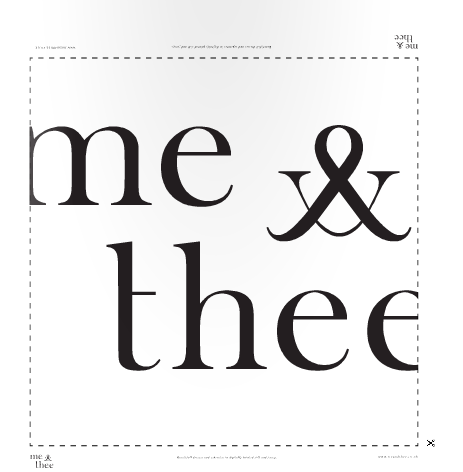
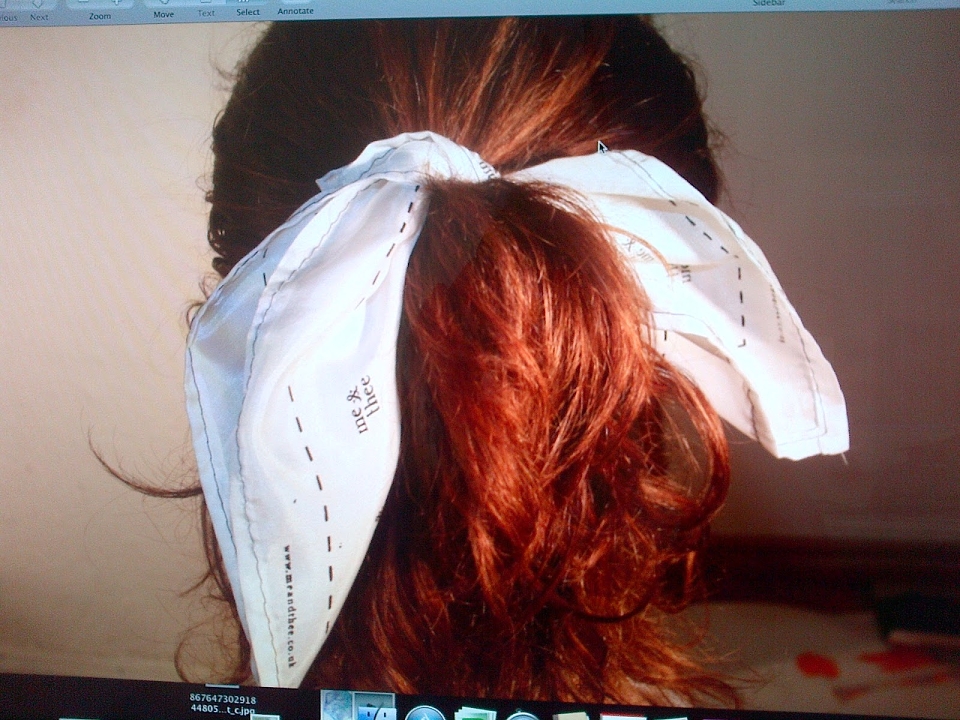
I designed an interactive silk poster which turns into a head scarf show below, when the scarf is worn correctly in a bow, the logo is shown at each end of the tie, promoting them to their target audience, young girls.
Brian, the company director was happy with our ideas and visual outcomes and we were happy to hear that he will be using them for his Re-brand next season.
MADEIT CREDITS
-

Me&TheeClient
-

Olivia ChapmanGraphic Designer / Textile Designer / Photographer