Nicolas Chacon
UX Manager
ABOUT
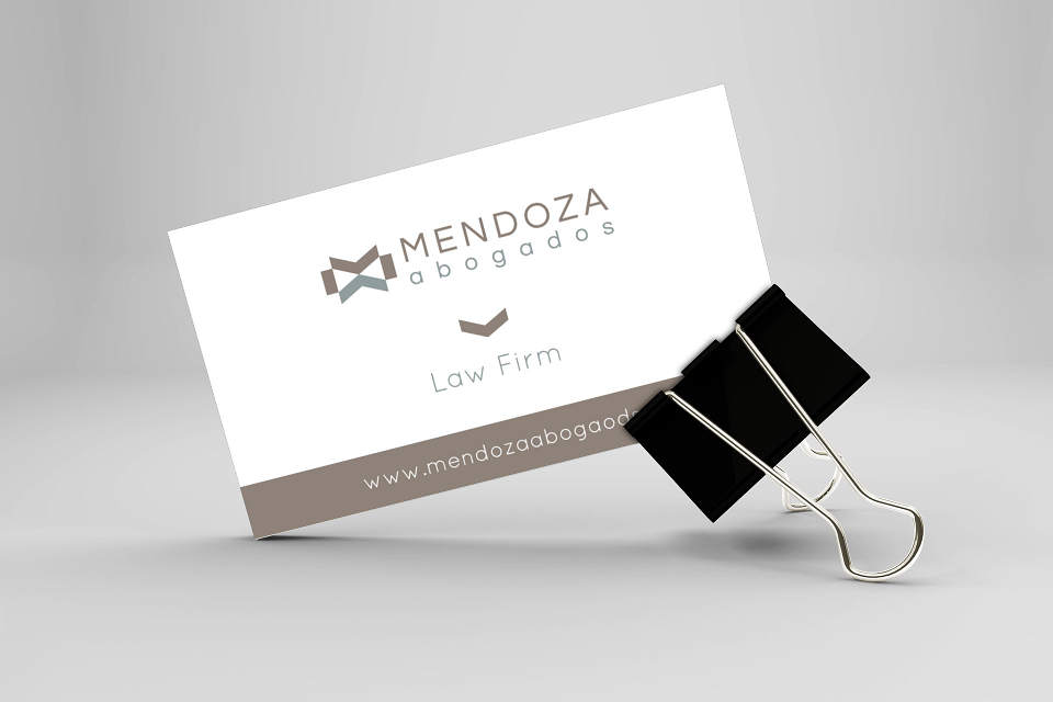
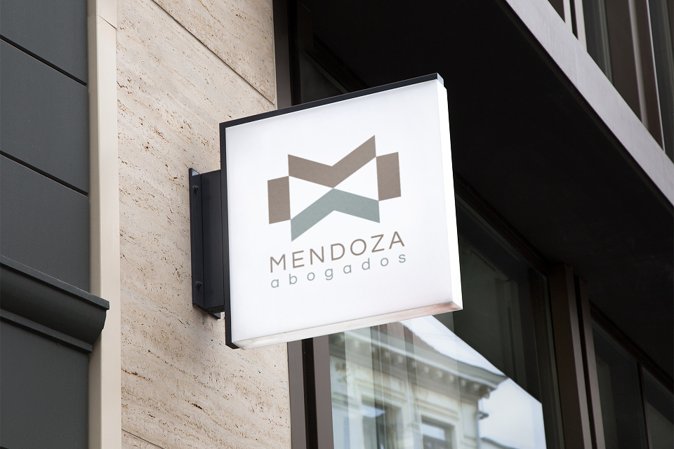
This well-know law firm in Spain needed a new corporate image as they are starting a new period of growth. We left the dark blue behind to replace it by a combination of warm grey and a subtle green, expressing still the professionality of the group while letting in some kind of freshness.
The symbol comes from the game of using the angular pieces to make the letter M above and the letter A below.
MADEIT CREDITS
-

Nicolas ChaconGraphic Designer