Mickael Aubard
Graphic Designer
ABOUT
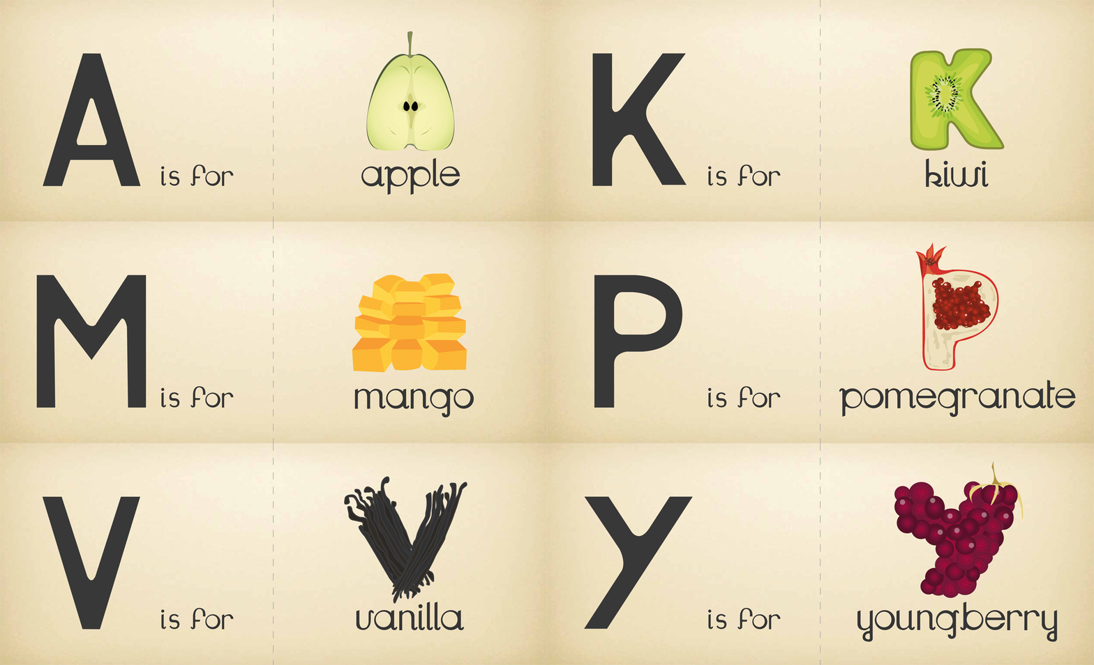
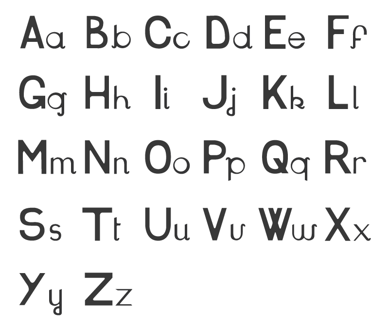
Whilst studying at Central Saint Martins we were given a brief in which we had to create our own font type. I have always been passionate about typography and illustration and wanted to be able to combine these two elements into the project. I chose to create a childrens book to help infants to learn the alphabet. I initially worked on the first font type which can be seen to the left. In order to appeal to young children I wanted a fun font that resembled the way that we are first taught to handwrite - clean yet almost clumsy.
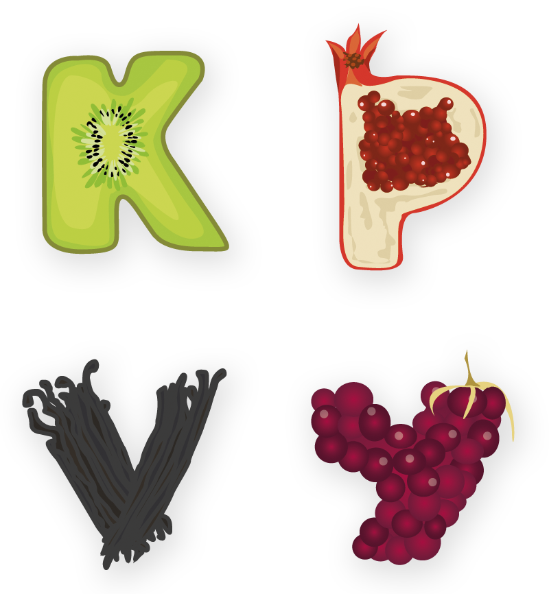
The challenge I set myself for the second font type was to be able to bring the associated image of the letter to life with an illustration of the fruit, and making sure that the that the fruit was recognisable despite its new letter form. In order to appeal to young children I tried to use fruits that they are accustomed to seeing to allow for the alphabet/word association to progress as naturally as possible. Lastly I used bold and vivid colours in order to capture the attention of the infants. I hope you like it!
MADEIT CREDITS
-

Mickael AubardGraphic Designer / Illustrator