Logo Geek
Manchester
ABOUT
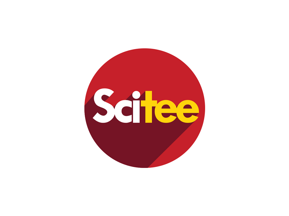
SciTee is a t-shirt company who designs science t-shirts that educate the wearer about scientific facts. Each t-shirt comes with a supporting fact card enabling the wearer to learn a new fascinating fact with each item of clothing. When working on this logo design I wanted the design decisions to be scientific, to reflect the core values of the business. I also wanted the SciTee logo to feel like a factual, educational establishment as most t-shirt business are pure style driven brands.
At first I started with the font choice. It needed to be carefully selected to look professional, and grown up whilst having a subtle ‘quirky’ feel to it.
The colour choice of red is based on ‘red shift’, which is an astronomical term used to describe the stretched wavelength of light. Distant stars in our universe appear to be red, as the light has been stretched, and shifted towards the red part of the spectrum, similar to the ‘Doppler effect’ with sound waves. Red is also seen in chemical reactions when heat is applied. Everyone loves the bangs, pops and explosions of science experiments, which is why I have also used yellow within the colour palette used to symbolise the feel of a chemical reaction or explosion.
Our universe if full of circular objects, which is why the logo design is encased in a disc. Look into the sky, and you see spots of light. Our sun is a ball of light, our planet earth a ball of rock. At the smallest level atoms are balls of energy. Our sun, one of billions of stars in our milky way galaxy draws shadows on everything we see, which is why a shadow draws across the logo, to reflect the shining light from our sun.
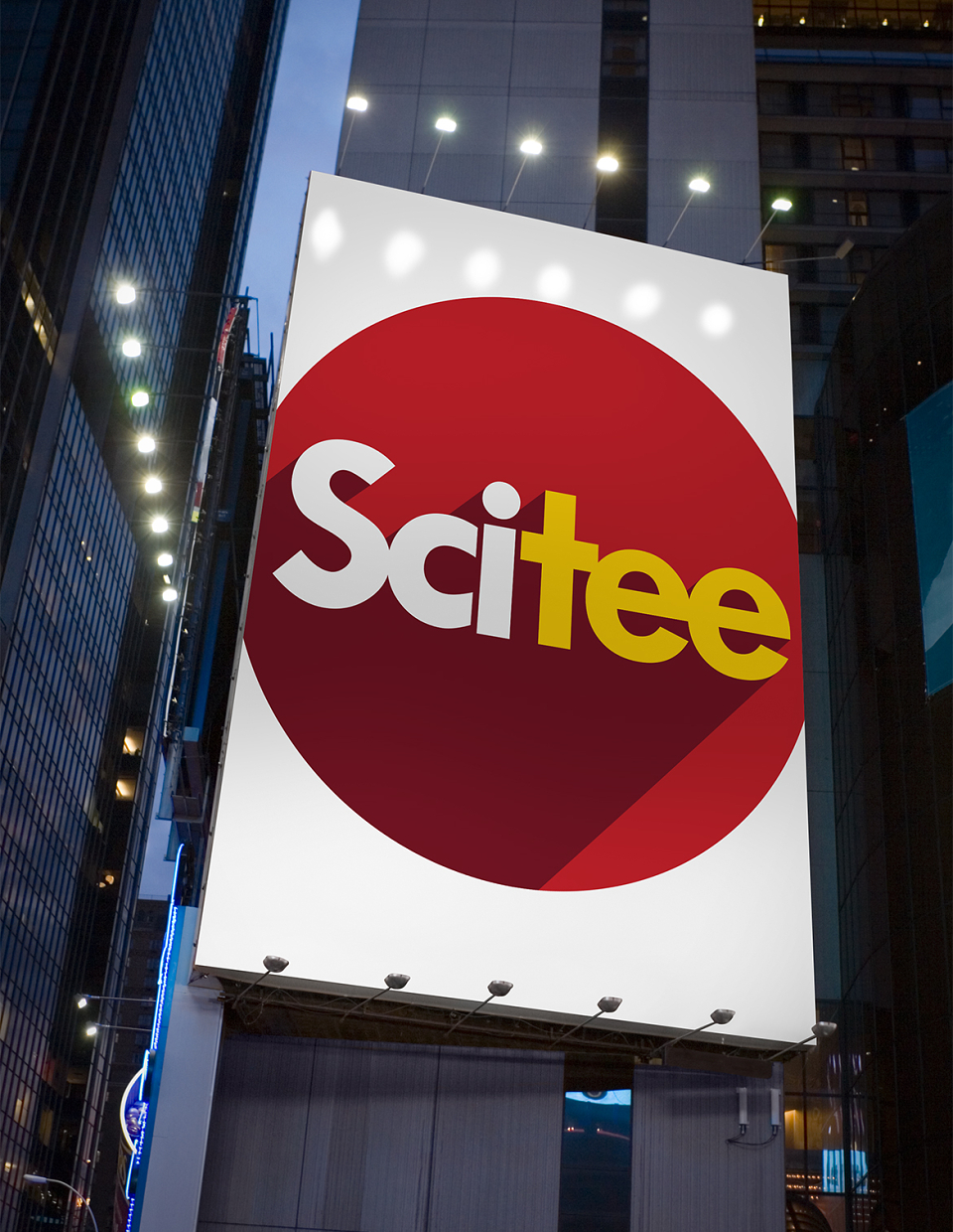
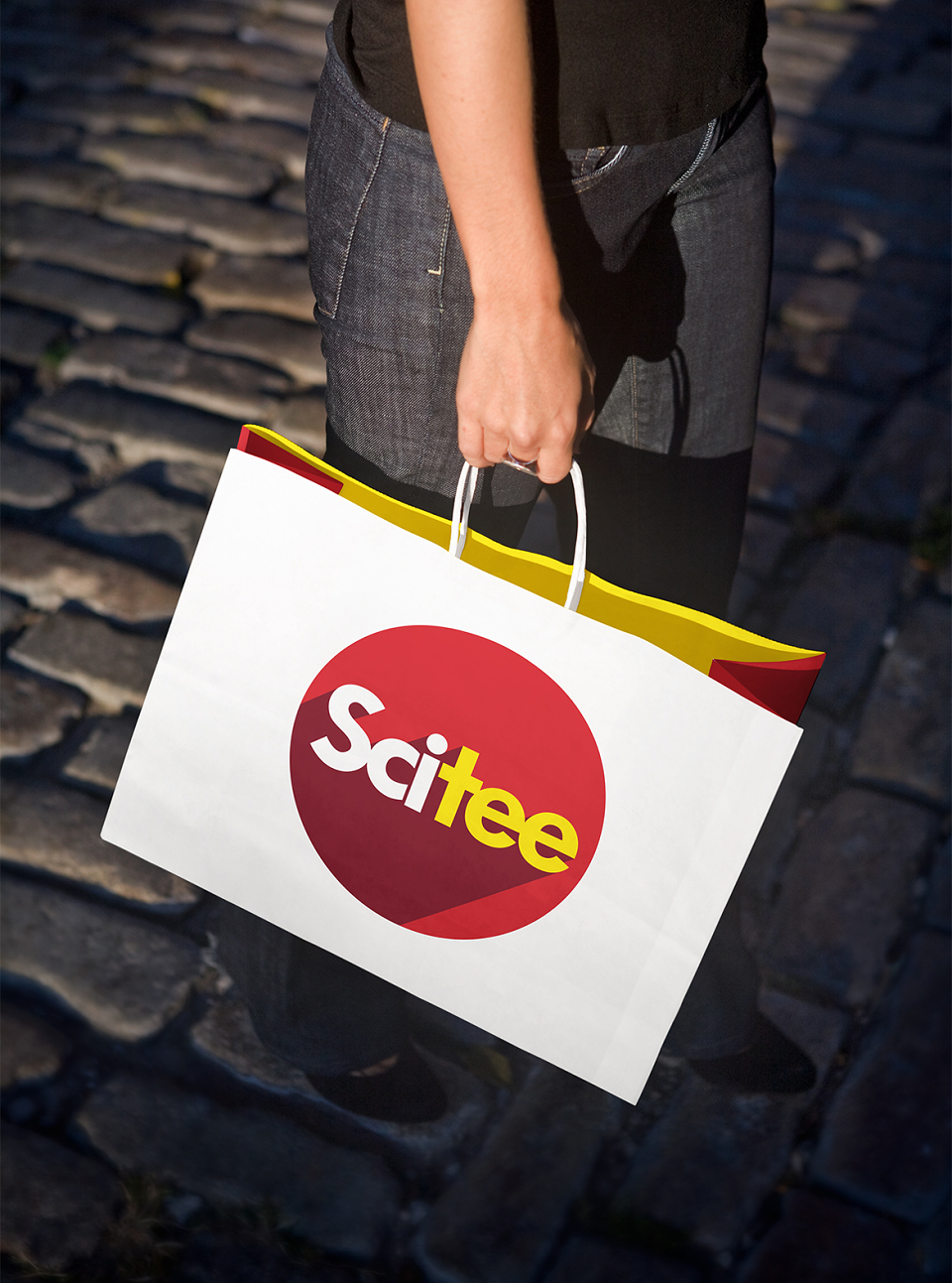
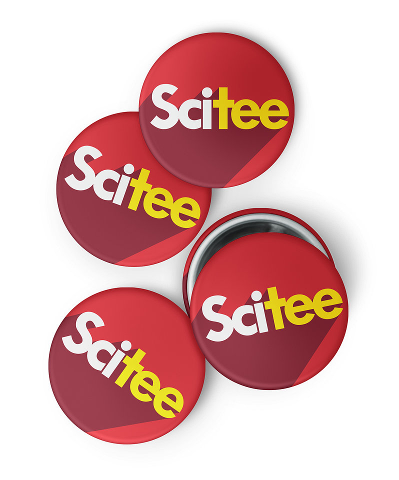
The final logo design is presented below.