Leonard Pitt
Graphic Designer
ABOUT
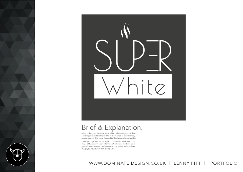
A logo I designed for an exclusive white crokery range at Lockhart. The range was to fit in the middle of the market, as a well priced, quality product. The name ‘Superwhite’ had already been decided.
The Logo plays on a fun but stylish imitation of a white mug. The shape of the mug fit nicely into the font selected. This font was to sympathise with the modern white crockery appeal and the clean image you would want from dining ware.