Karen F
Creative artworker / Designer
ABOUT
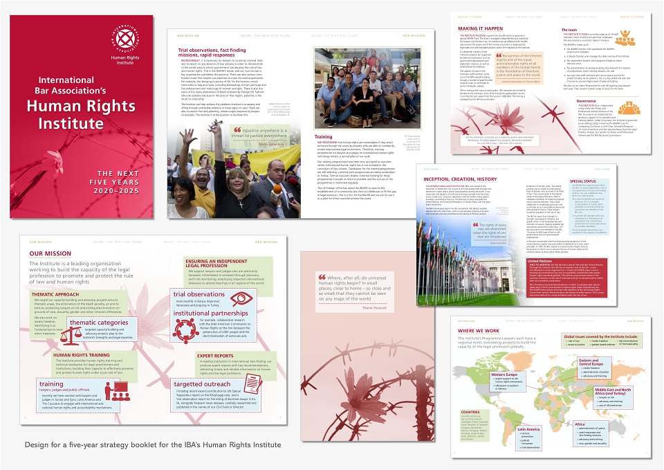
Brief: create a new design for a 5-year strategy booklet explaining the work of the Human Rights Institute.
Execution: there was not much of a brief for this project, which I worked on with Baroness Helena Kennedy and the head of content, other than that it had to have a high-quality feel, incorporate quotes from iconic figures and have a red cover (her favourite colour).
I initially worked on the cover, changing the suggested pillar box red to a deeper hue for a more serious tone, and experimenting with the font size and arrangement to give the text more impact. I felt the cover needed extra visual appeal, so I also sourced an image of a flower threaded on barbed wire to represent the hope that the HRI can bring to desperate situations.
I chose a limited colour palette for inside, which changes subtly in each section – although the original warm palette had to be amended slightly to include more colour and introduce blue into the scheme.
The text and some images had already been supplied, and one challenge was to create a cohesive design when some of the pages were text and image heavy, while others had less copy and a selection of mismatched icons. Here the flower motif proved useful, as I was able to use it to add extra interest to the plainer pages and create more of a theme throughout. I also sourced new icons so that they were more unified in appearance, as well as a few alternative images to replace some of the less appealing ones.
Although the corporate font is used throughout, I introduced new styles and weights for large headings, intros and quotes that were distinct from other IBA materials, together with subtle indents, bullet marks, dotted lines and colour boxes to bring additional character and colour to the pages. I also selected an alternative font for the quote marks for a more friendly shape that echoed the use of the dotted lines.