Durmo Studios
Designer
ABOUT
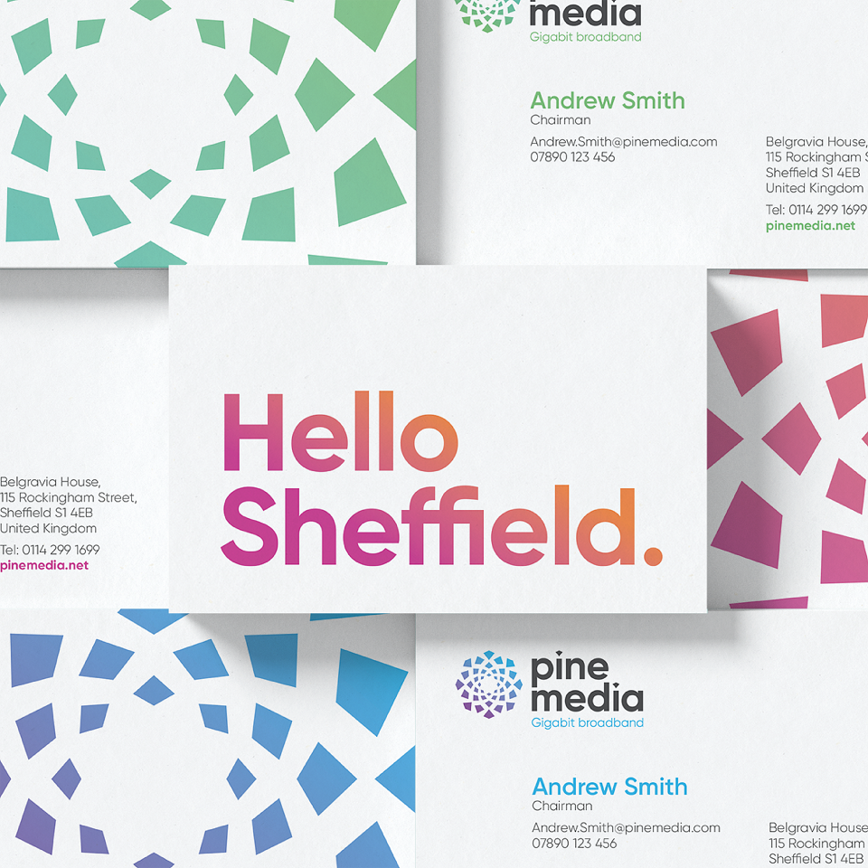
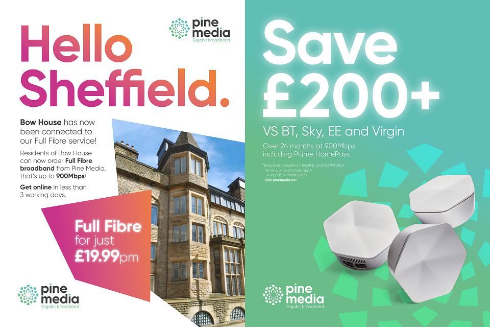
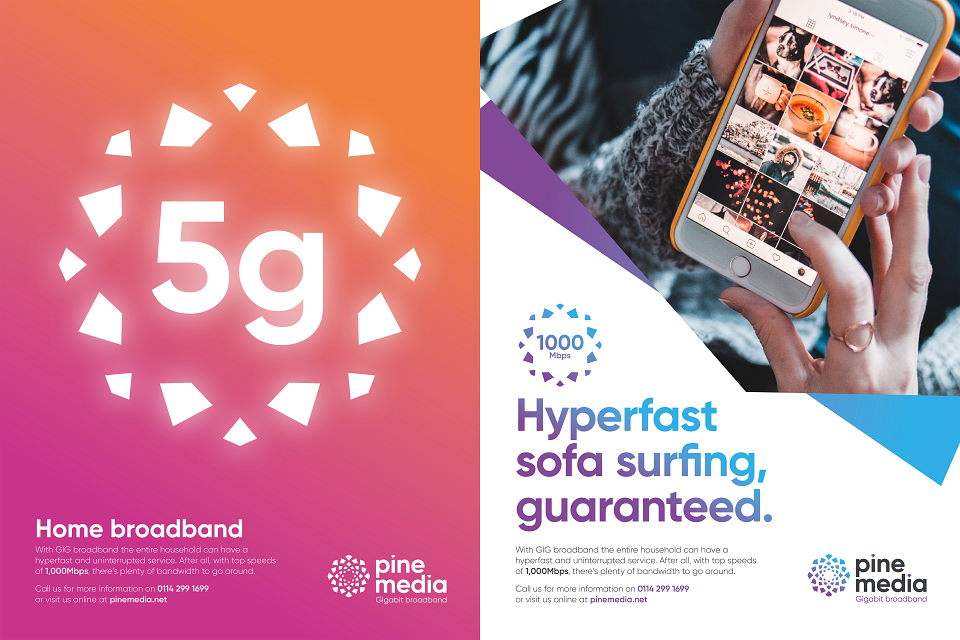
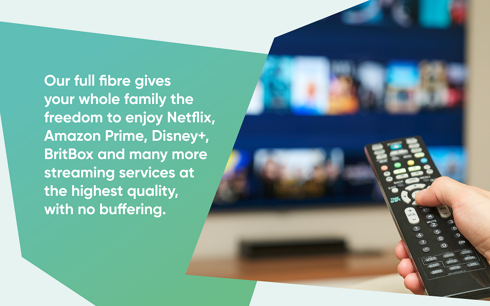
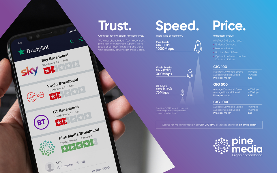
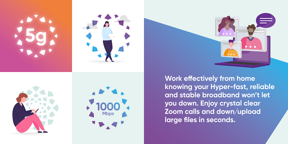
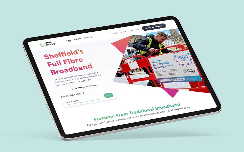
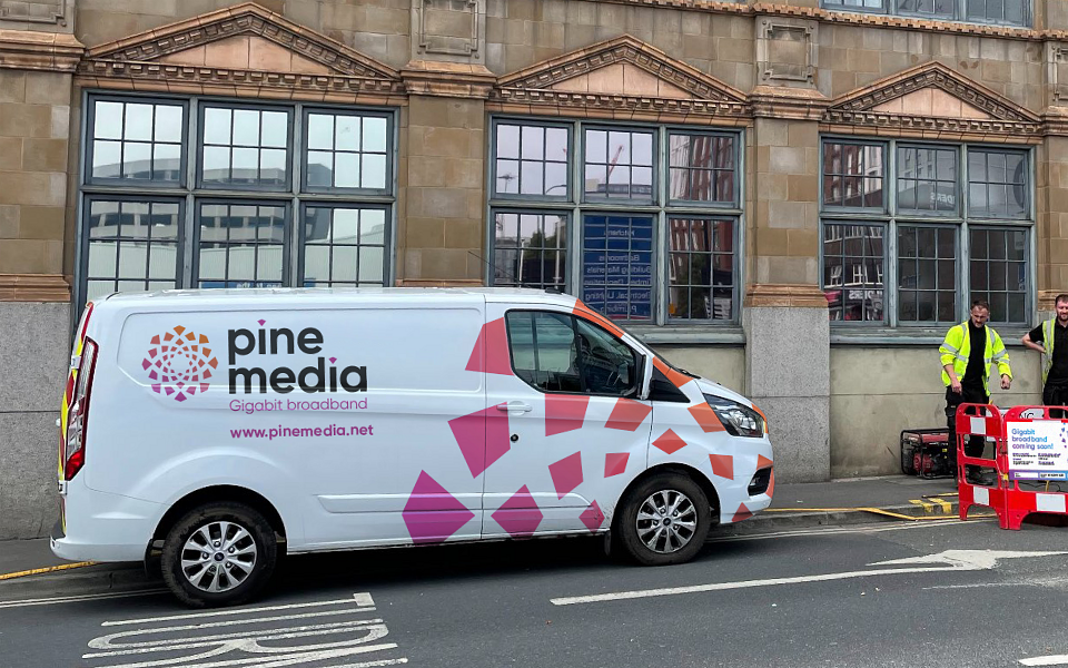
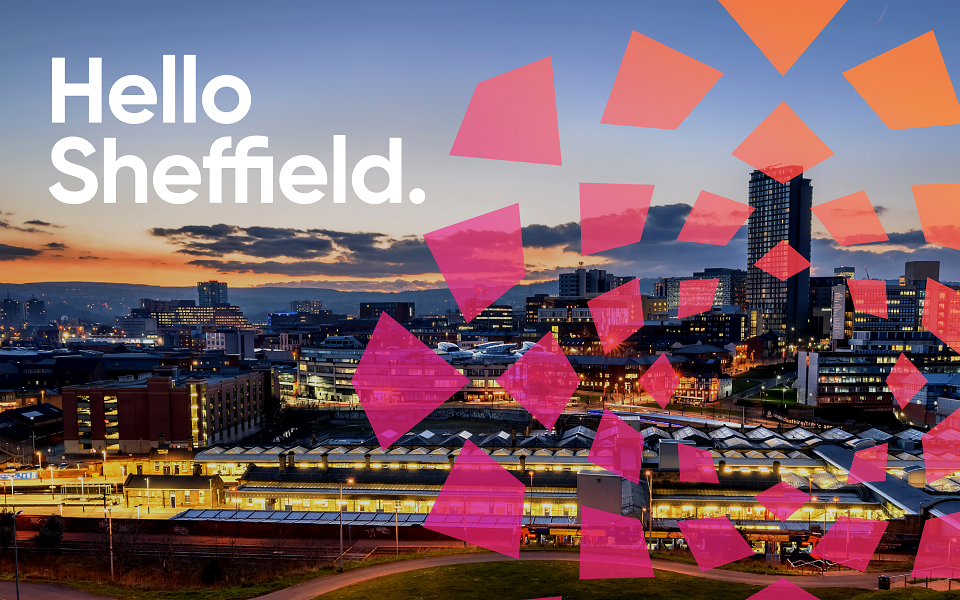
An exciting and energetic rebrand for local broadband provider Pine Media. The result - bundles of energy to match the power on offer. A new lockup, colour palette and illustration style help define it from the competition. The main icon was created to be able to become a valuable graphic element, used collectively or as individual items. The abstract shapes are equally adaptable to use as image containers and text holders. All the elements together help create engaging and informative communications that are instantly recognisable and memorable.