Dan
Creative Designer
ABOUT
In the world of multiple ground-works, AMS can't be beaten. Unfortunately, however, their brand didn't reflect that.
Approach:
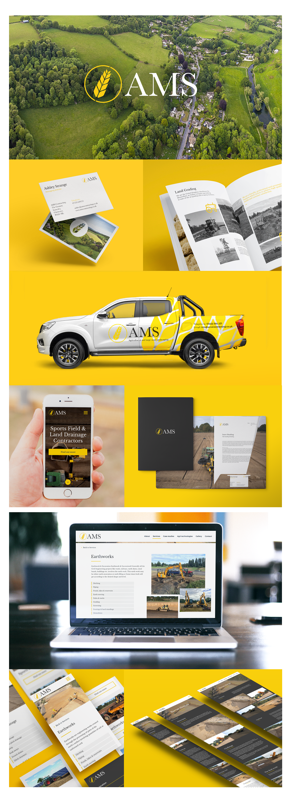
AMS needed a brand and a position that reflected their capabilities. The experience and reputation that AMS had established far exceeded that of any of their competitors, so this was the main message the brand needed to give out. The business was broken into eight different services, to ensure prospective clients can understand exactly what the business offers.
Execution:
AMS were keen on reflecting their farming background in the new brand, so a carefully crafted icon and a vibrant colour palette of yellow and green was used to make a connection with the earth. Arial photography was used to reinforce this, and a beautiful serif font was chosen to reflect the business’s heritage.
Results:
Within the first three months of rebranding, AMS acquired their largest contract to date, with the UK’s largest property development company, Barratt Homes.