Coley Porter Bell
London
ABOUT
Background / Brief
Despite over 15 million regular Advantage card users and 576k active social followers giving them a high rating for trust, recognition, and value, Boots customers overall felt the brand had become dated and old-fashioned. Coupled with the world of well-being becoming more competitive, and Boots was feeling the pressure.
Solution
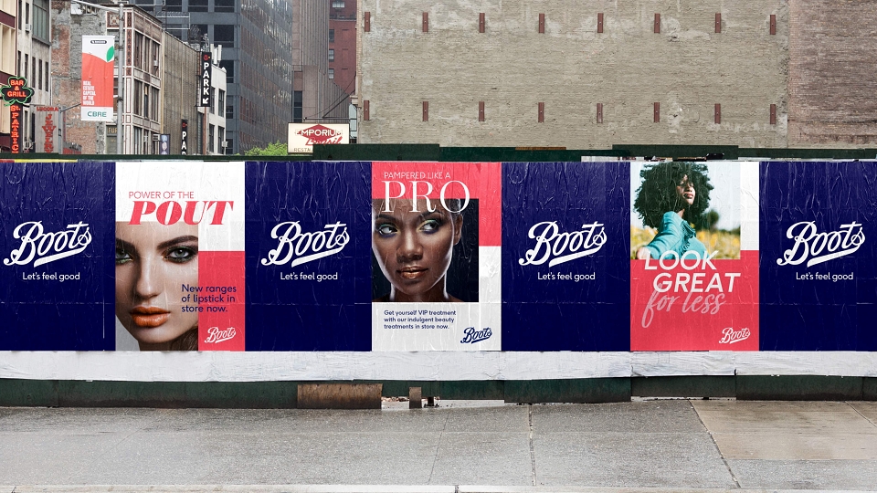
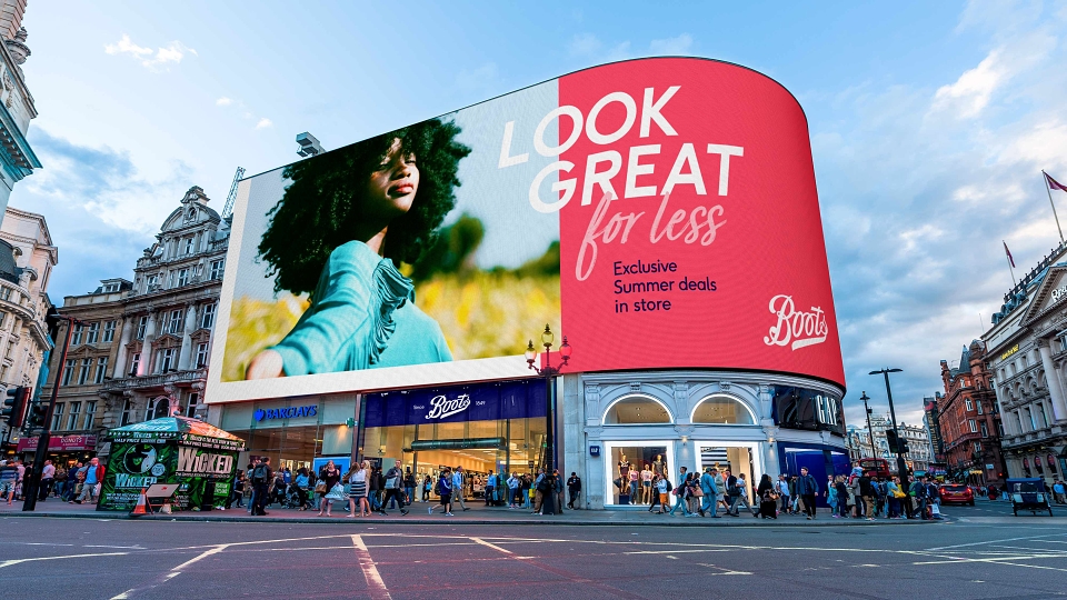
The Boots brand purpose is to ‘Champion Everyone’s Right to Feel Good’ so the creative strategy for the masterbrand was to project a true sense of confidence which reflects this.
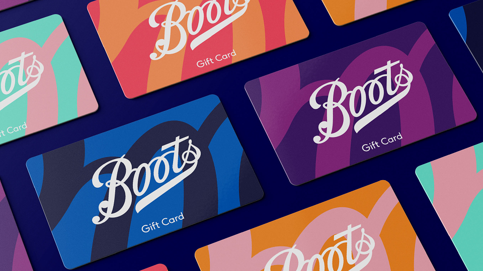
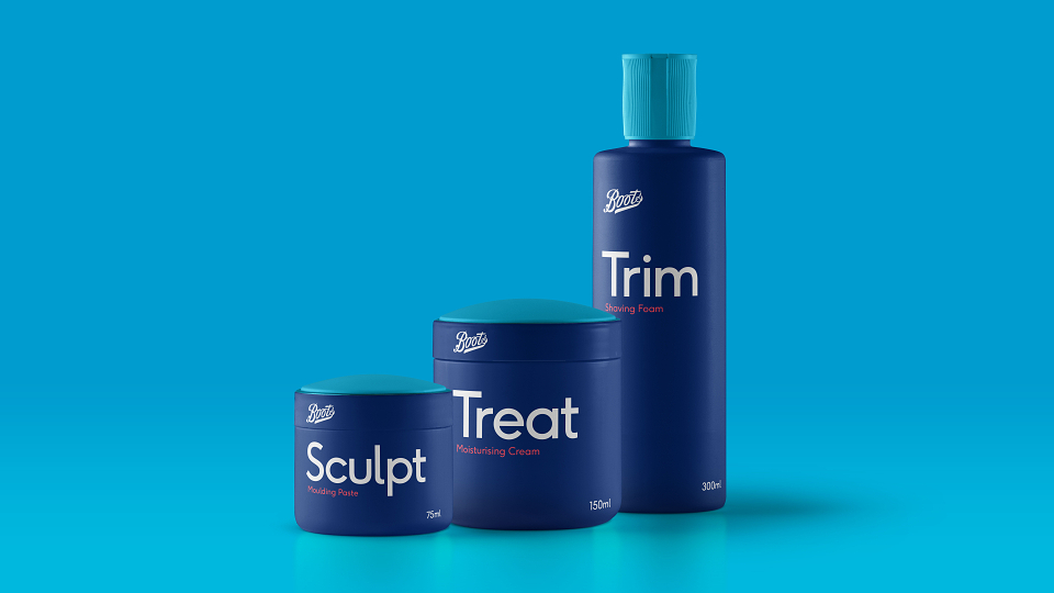
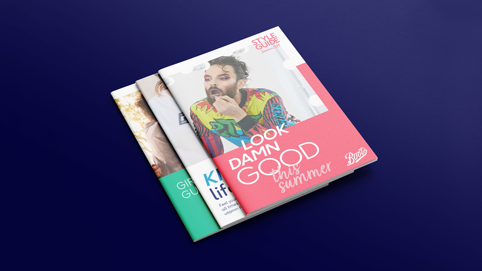
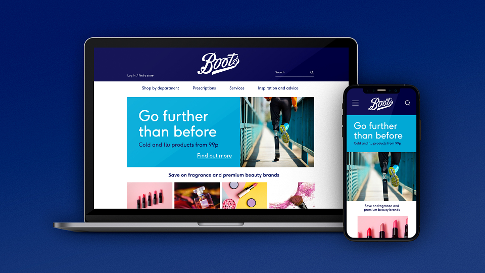
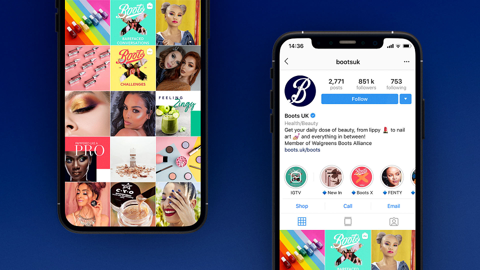
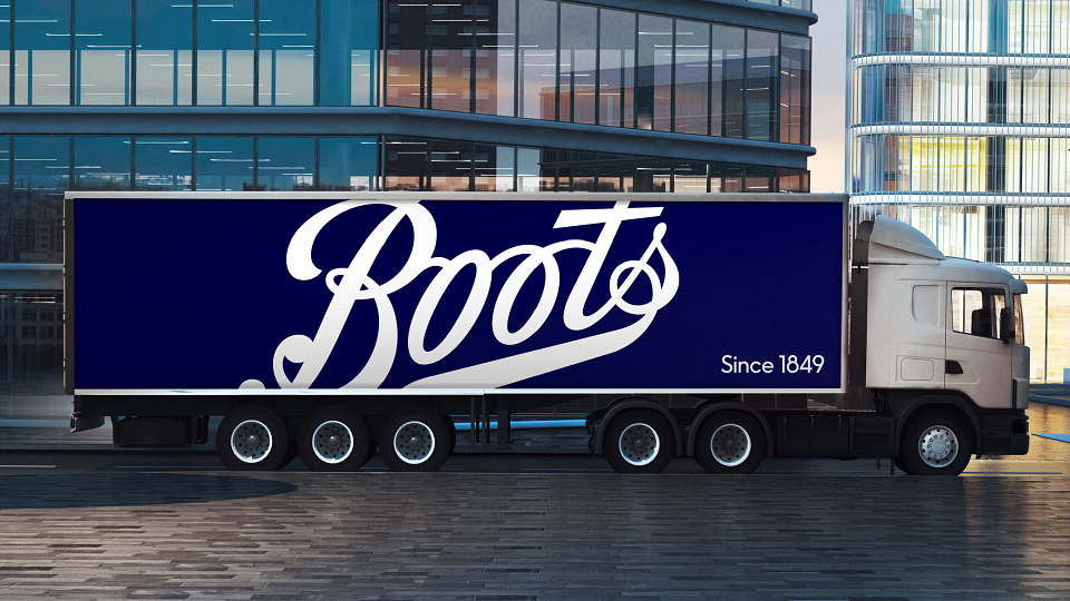
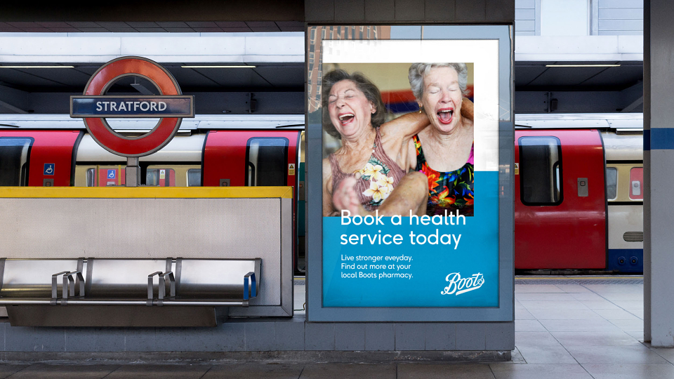
To start, we worked with award winning type designer Rob Clarke to liberate the Boots logotype from the restriction of the 1970’s lozenge and implemented a new screen-friendly typeface. Colour palettes were carefully selected to range from trusted to vibrant, but also to be AA compliant, making the brand accessible to all across every platform.
Using brand experience principles we rebuilt the masterbrand to work across the entire connected ecosystem from retail environments, signage, packaging, print and physical formats through to . com, digital communications, video and social. We created a framework for all communications from the brand that felt both fixed and flexible, giving them a proper brand DNA.