Charlie Hale
Graduate
ABOUT
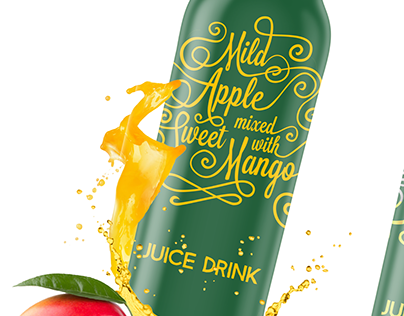
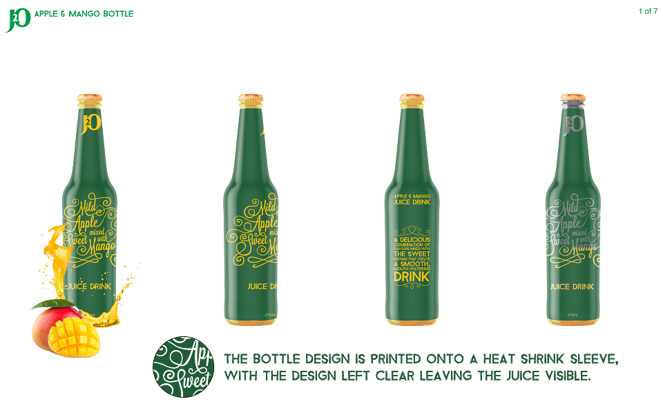
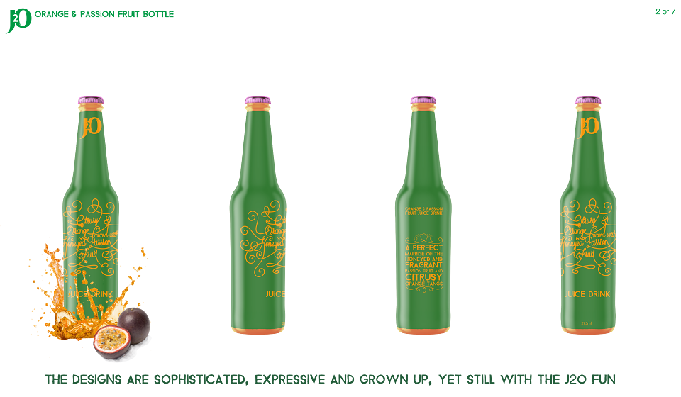
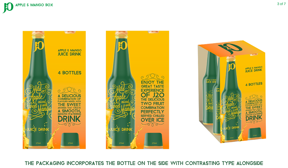
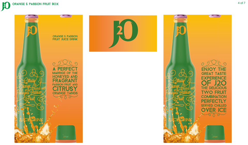
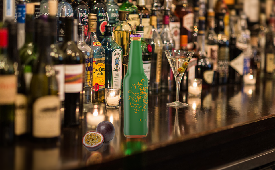
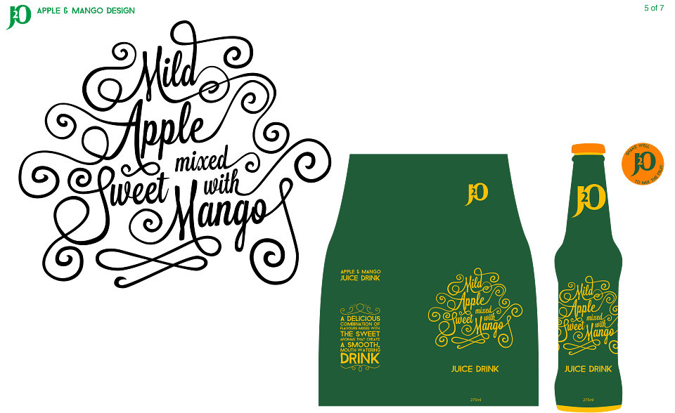
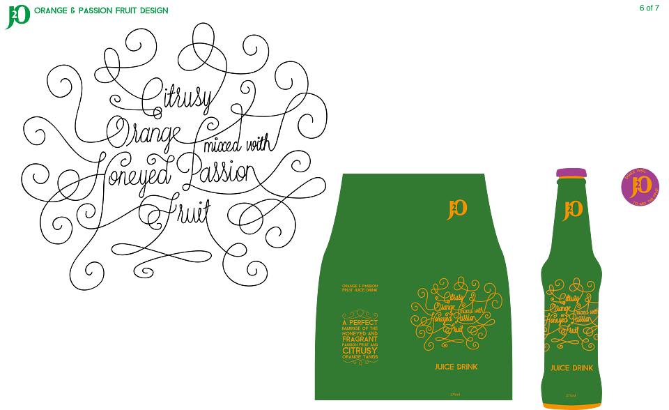
I set out to make the new designs more appealing and stand out to the target audience. My designs make the bottles feel more special and bring back their heritage. My elegant type contrasts along side the strong type, giving a sophisticated yet fun look. I have focused on the use of the descriptions to emphasise the products flavours and careful blending. This gives it a hand crafted and unique look. The logo has been simplified and moved to the top as I feel that it fits better there as the focus is on the flavour of the drink. I think the minimalistic design with little on the bottle gives it an unpretentious and grown up look. The heat shrink sleeve round the bottle will have clear type, with the juice inside showing through. The bottle itself is something that someone would order and proudly hold in a bar. The two different bottles stand out next to each other with the different yet similar type and the bright bottle caps. I made the designs fit in with the feel of the website by capturing the brightness and strong use of type. I have kept the recognisable colours, specifically the green of the bottles as this is what customers remember J2O by. On the 4 pack I have kept the image of the bottle as this is what currently stands out on the shop shelf. I have also added splashes of juice as I feel this increases the taste credentials even more.
MADEIT CREDITS
-

Charlie HaleGraphic Designer