Brad Garner
Graphic Designer/pre-press
ABOUT
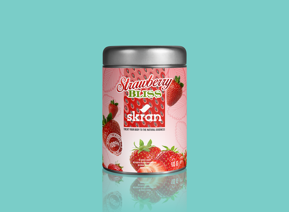
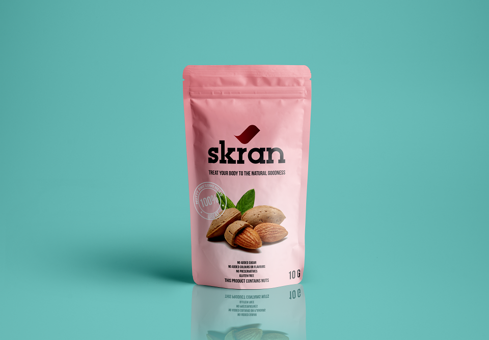
This was a Starpack competition brief I chose to do as my Minor project, for my BaHons Course work. The brief was primarily for health food packaging but didnt specify a brand, so I thought that would be a great opportunity to create a brand and logo.
I spent a a day researching health food brands. I researched via the web, library, visits to a range of health shops and supermarkets and in my personal library. I looked into trends within the health food market, and also what packaging trends were expected for 2017, This lead me to the decision that clarity was the key to a successful brand solution. With this in mind, I began to scribble down names that would apptly describe the content of the packaging. I then took those names and shortlisted the ones which I felt were catchy and lend themselves well to this kind of market. I came up with
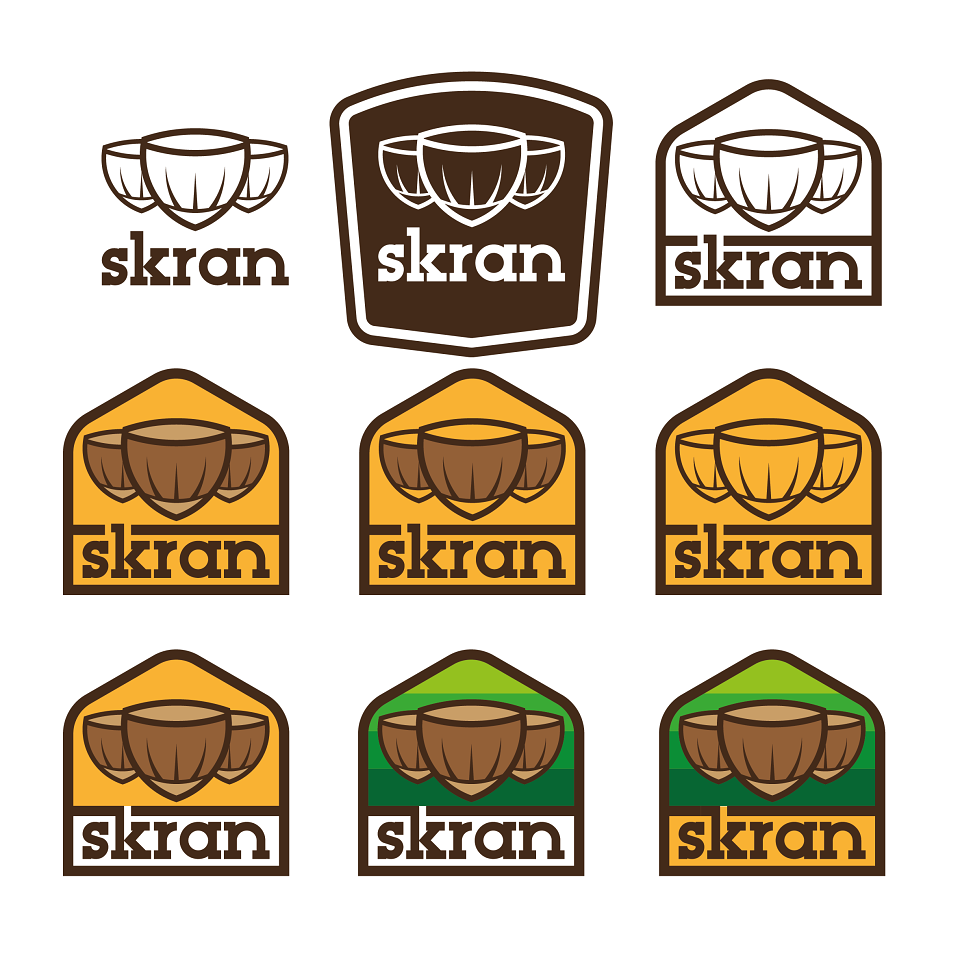
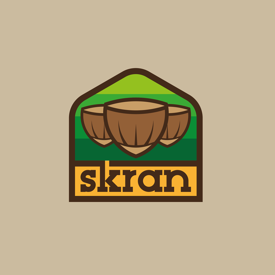
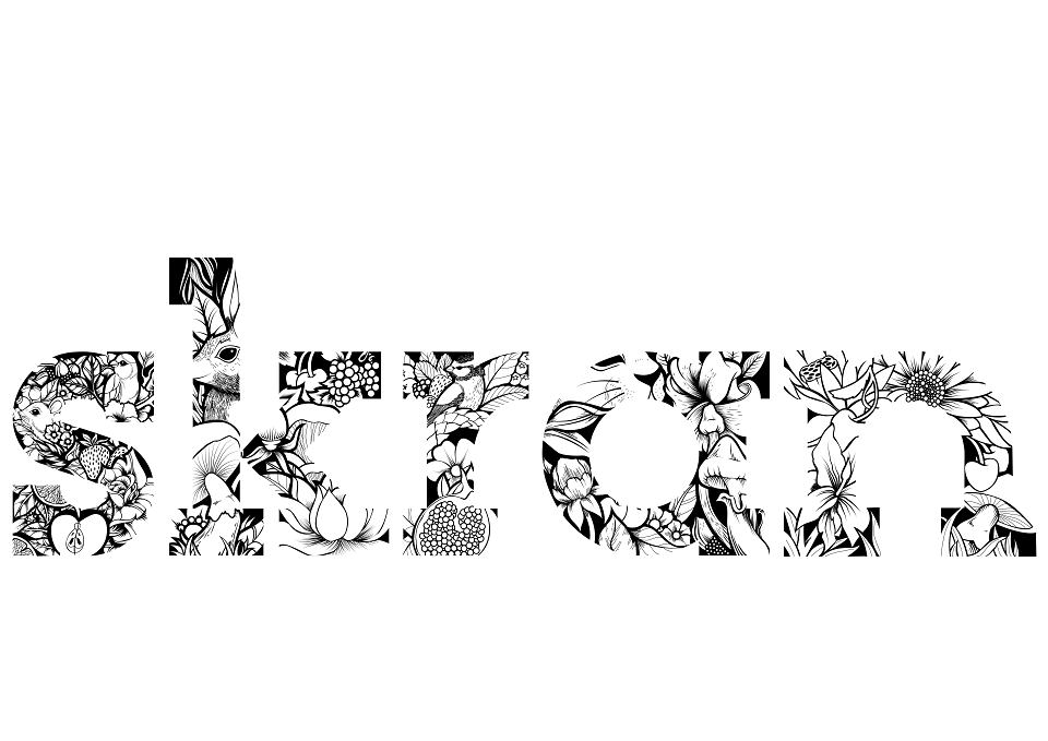
“Skran” a UK slang term for food. I felt it had relevance, humour and described the content well.
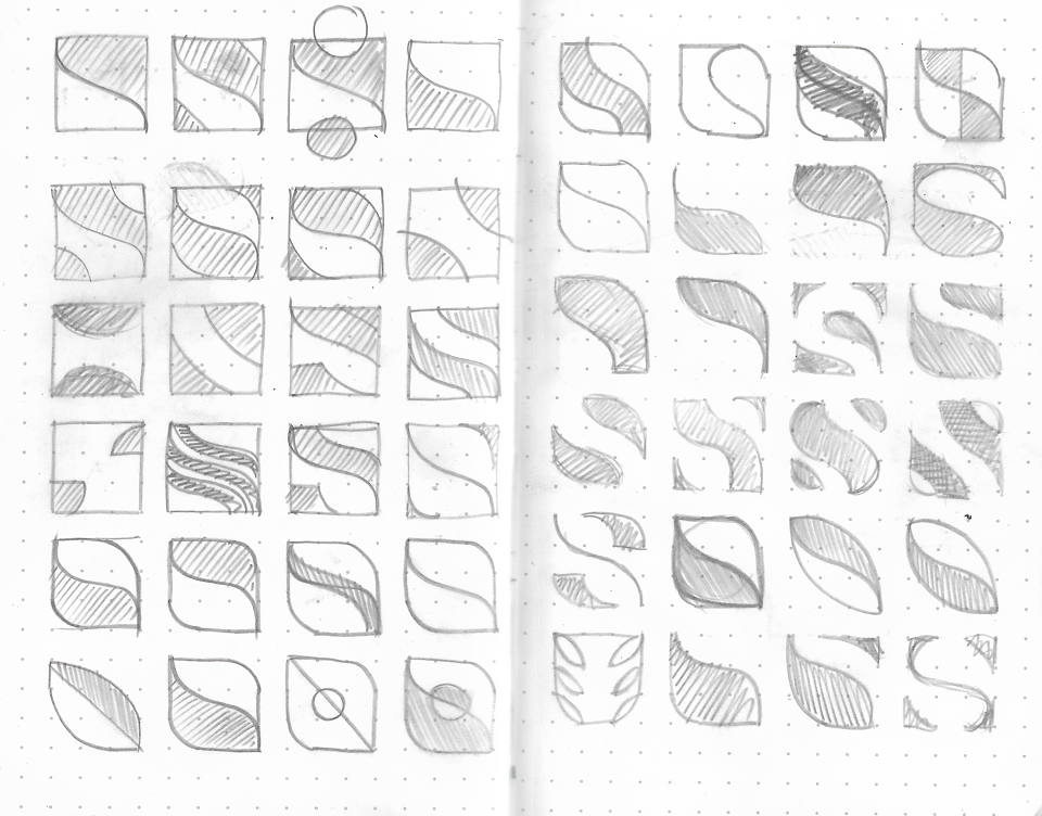
I then began to sketch rough ideas of how the logo would look. I felt a serif style typeface would deliver a corporate look, whilst the boldness would give the brand a look of fun.
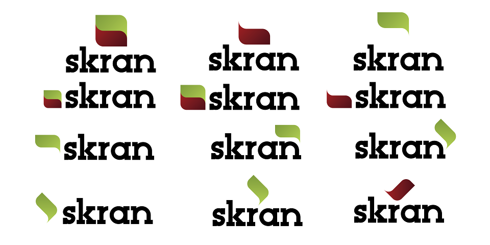
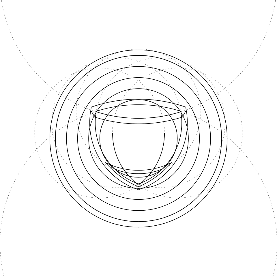
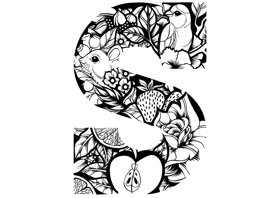
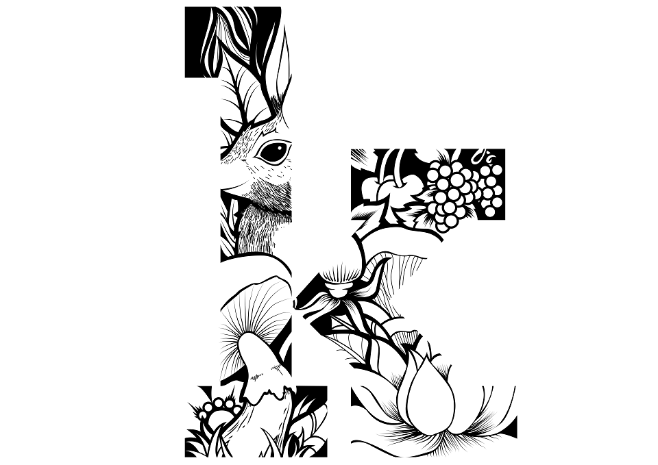
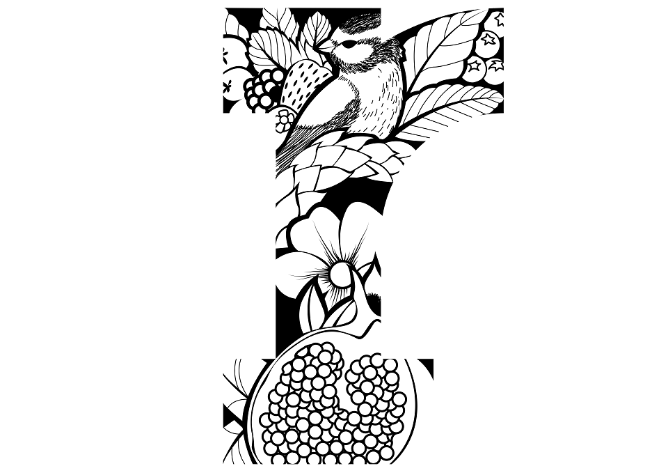
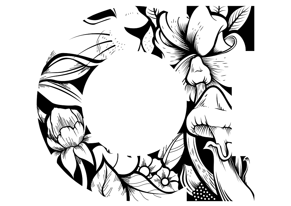
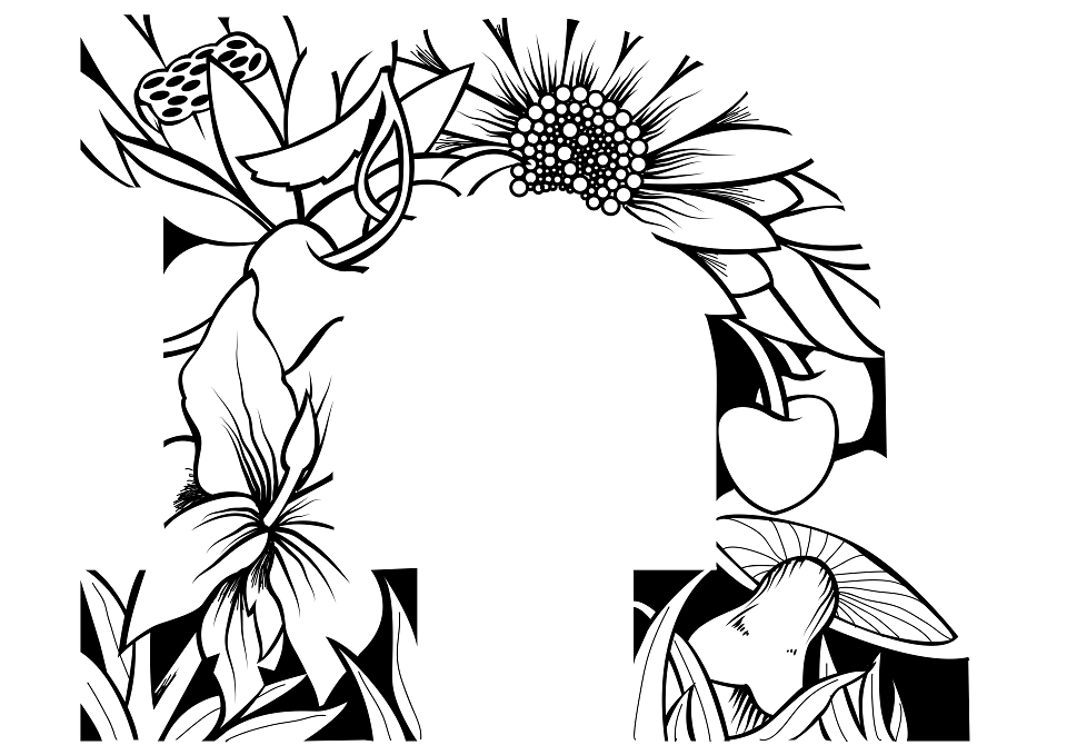
I decided that it would be better if the font was one that was unique. So I began to design a simplistic bold serif typeface for the branding. I also decided that it would be good to create the whole alphbet in upper and lower cases, in order to be able to use it on all brand media. Once that was created, I also designed a glyph based on a stylised S. I researched how much of the S information would be needed, in order for the glyph to still resemble an S. After spending some time drawing different glyphs, I decided that simpicity was the best option. Once in
place, I experimented with direction and angle untill I felt it looked natural. During my research I noticed a distinct shift from fancy packaging designs to stripped back almost Swiss style aesthetic. tThis lead me to summise that clean layouts using natural looking material, would be a good direction to go. With this in mind, I explored packaging that used natural materials. Whist doing so, I experimented with using greese proof paper as a method of packaging food products. This lead to the problematic issue of printing on such a media. Although possible, the cost of production would boost the cost of the product to the public, and possibly be detrimental to sales. So I went back to the drawing board and created a stylish packaging solution that is minimal, traditional and contemporary.
MADEIT CREDITS
-

Brad GarnerGraphic Designer