Stuart Bradley
Lead designer
ABOUT
THE BACKGROUND
Moorgate Finance is an aspirational, dynamic and forward thinking company with a young, dedicated team, that want to appeal to wide ranging and diverse industry sectors, from young dynamic start-ups to long-established, traditional organisations... but their existing branding was very old school ‘Finance sector’.
The new identity still needed to present a professional and experienced front, but also disrupt - to move away from the old fashioned finance sector look and set a new standard that is bold, future facing and digital savvy, akin to the new wave of digital banks that are challenging the old guard of the finance sector.
THE SOLUTION
I proposed they dropped the ‘finance’ from the name to make a more concise logo. I then created the M from 3 lines to create a simple but striking icon. Each piece of the ‘M’ can be used as graphic elements throughout the visual identity. The ‘M’ can stand alone for social media avatars etc.
The stacked layout is reminiscent of traditional logo styles, which represents the established and professional nature of the business. The straight edged san serif font is also sensible and professional whilst setting a modern tone.
Blues are used as the brand colours for their positive emotional properties associated with finance (intelligence, communication, trust, efficiency). The blended colour fill adds an extra dimension to the icon - it has a depth, almost as if you are looking through a window onto the colour scape beyond.
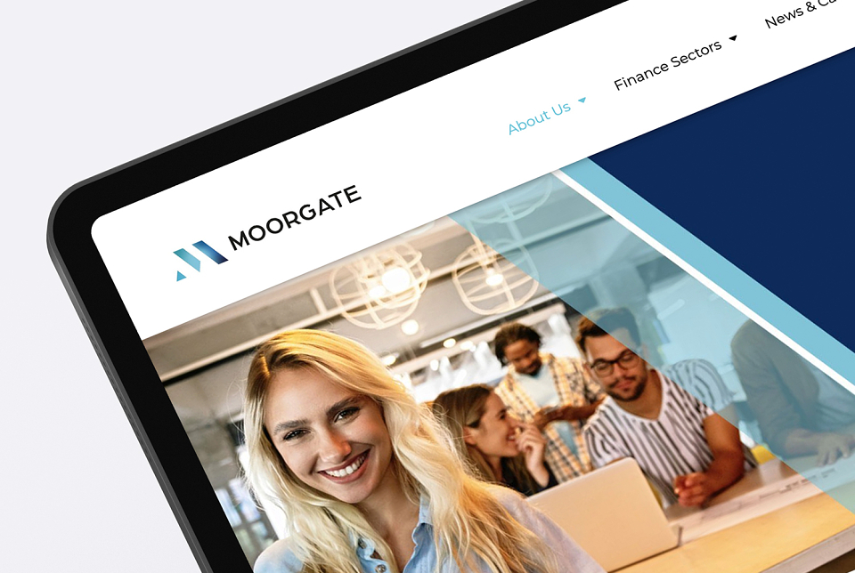
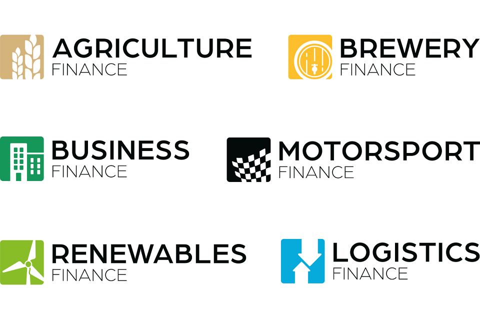
I created logos for each of their industry sectors, with the icon colour closely linked to the subject matter: be that through emotional properties, name of the colour, or simple product association. The individual colours were then used throughout the new website and other marketing materials.