Stuart Bradley
Lead designer
ABOUT
THE BACKGROUND
Mr Sander is a residential and commercial wood floor restoration business based in London. They have a lot of local competition with very similar and uninspiring branding, so wanted to seize the opportunity to really stand out as a quality service supplier.
THE SOLUTION
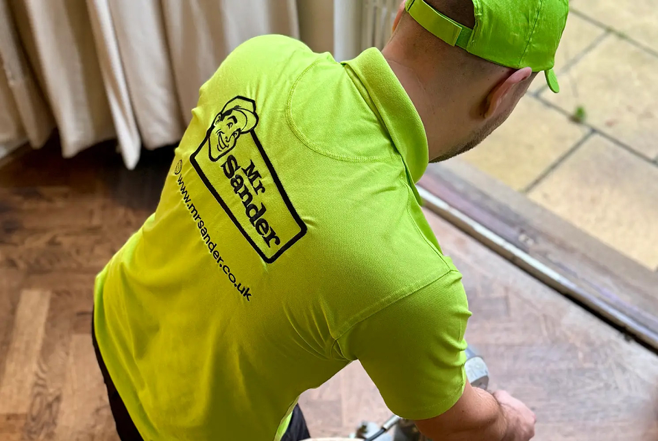
Suggesting a complete business name change, I created a personality for the business with ‘Mr Sander’ - the persona being everyone and anyone within the business – from the person that takes the call, to the person that arrives at your door!
With the Chordettes ‘Mr Sandman’ going around my head, I adopted a timeless 50’s style, and a friendly faced workman graphic to present a welcoming and professional tone.
I then brought the style upto date with a heavy outline and bold colours, and created single colour options to give more visual flexibility.
The face element has huge usability within the over-arching brand identity: for social avatars, pull out CTA’s in the website and brochures etc.
Green is a very positive colour, representing harmony, restoration, reassurance, and environmental awareness, with the complimentary purples representing warmth, security, and abundance.
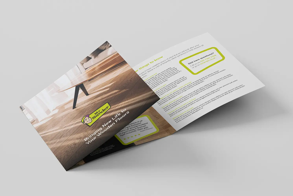
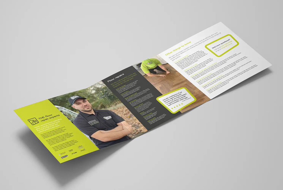
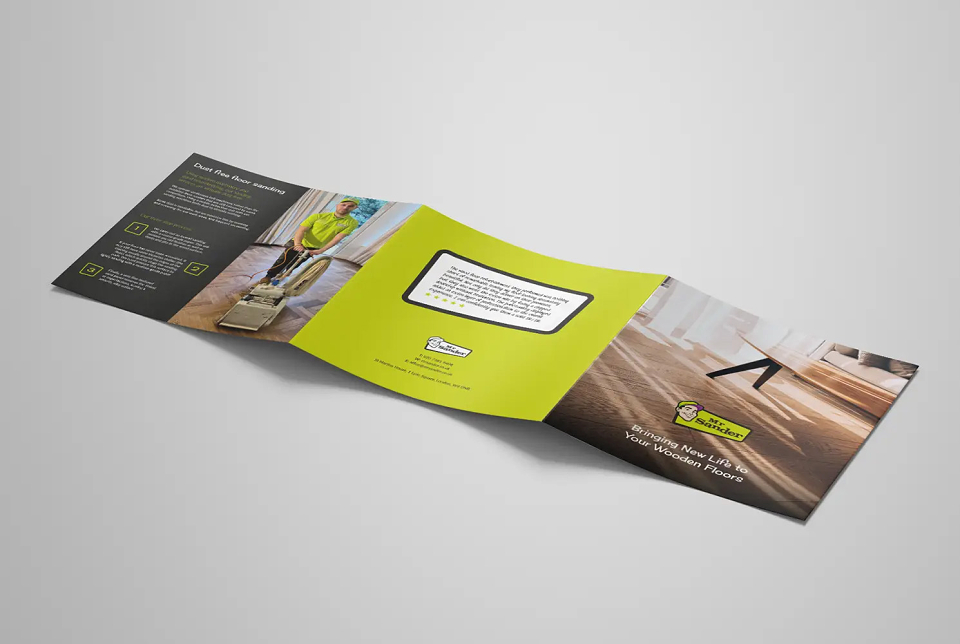
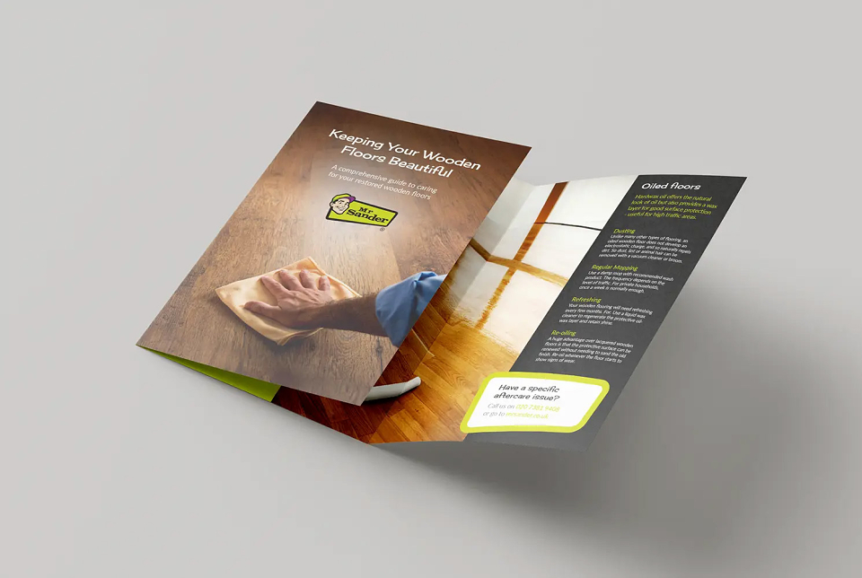
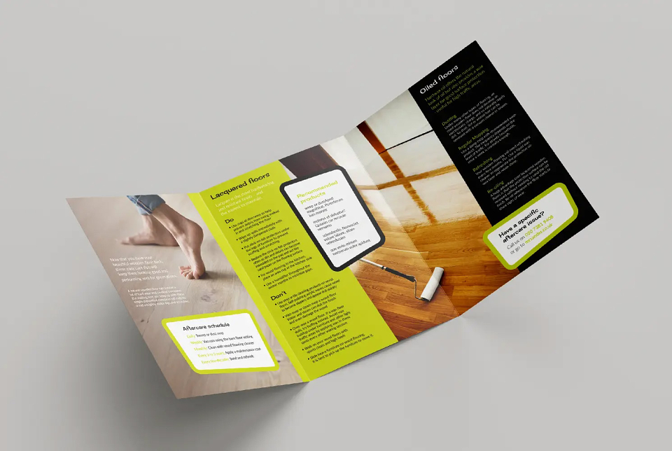
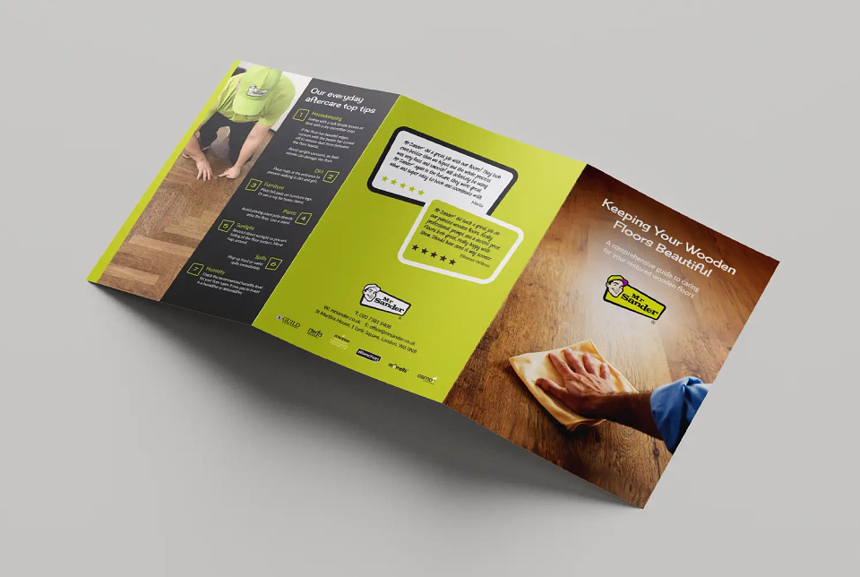
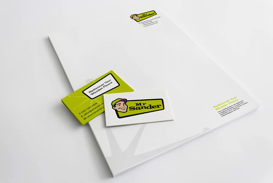
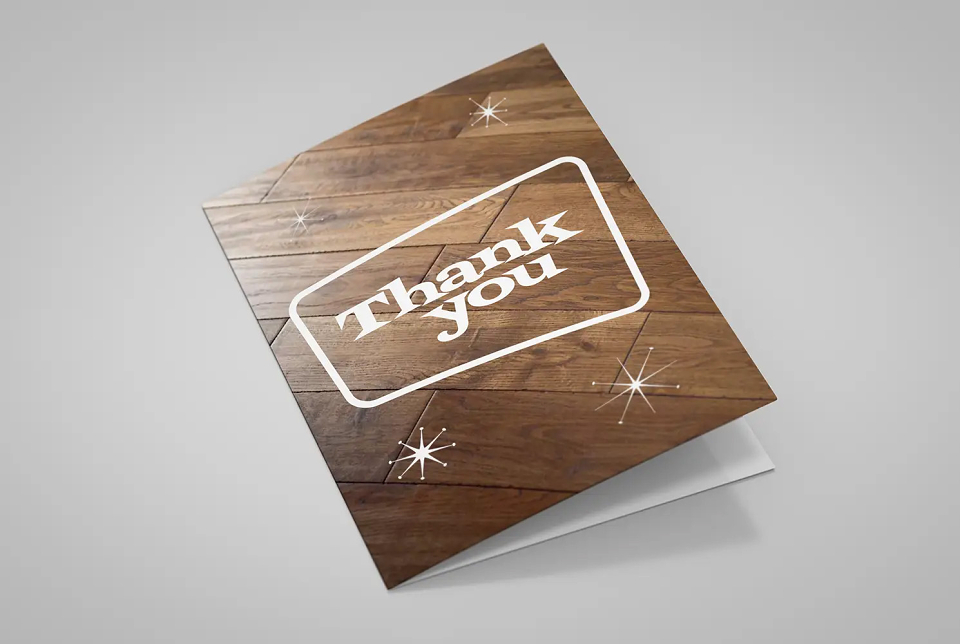
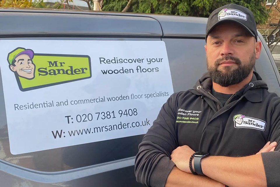
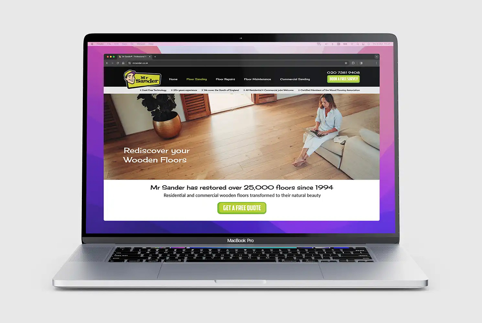
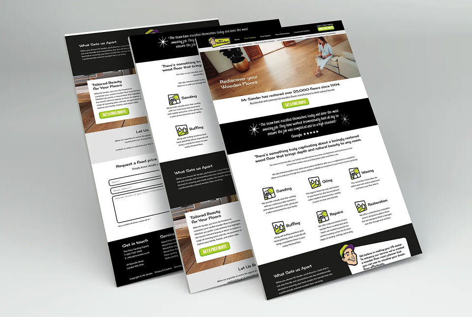
I then worked this up into a joined up visual identity across a new website and marketing materials.