Frank Hernandez
Art Director / Creative Director — Branding, Visua
ABOUT
For Solum, the challenge was to build an identity that connects with a new way of understanding the gym: a space for consistency, discipline, and personal evolution. From the studio, we developed a branding system that translates this mindset into a solid, aspirational visual language, aligned with training as a way of life.
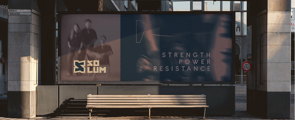
The starting point was to place the gym at the core of the brand narrative, understanding it as a daily ritual and a space of belonging. From there, we built an identity that communicates strength, power, and resistance, without relying on aggressive, overused, or clichéd fitness codes.
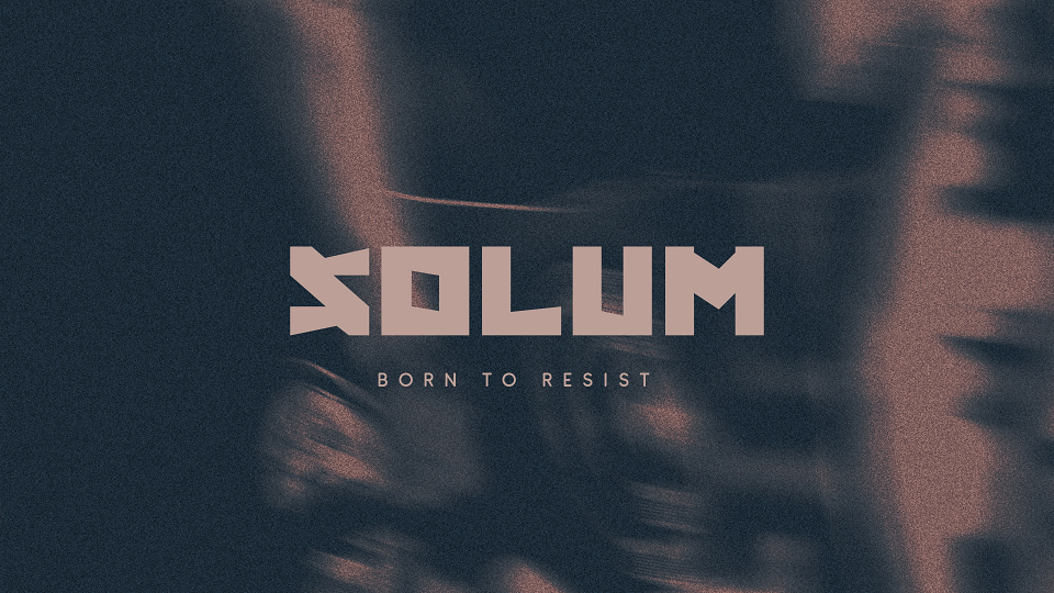
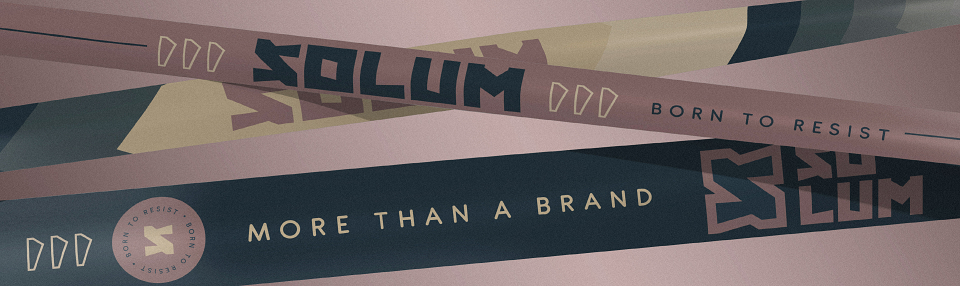
Typography becomes the backbone of the visual system. Its construction conveys weight and stability, qualities earned through consistent practice, while diagonal cuts introduce tension and dynamism, creating a sense of continuous forward momentum. The result is a typeface with impact, capable of expressing presence, determination, and character through form alone.
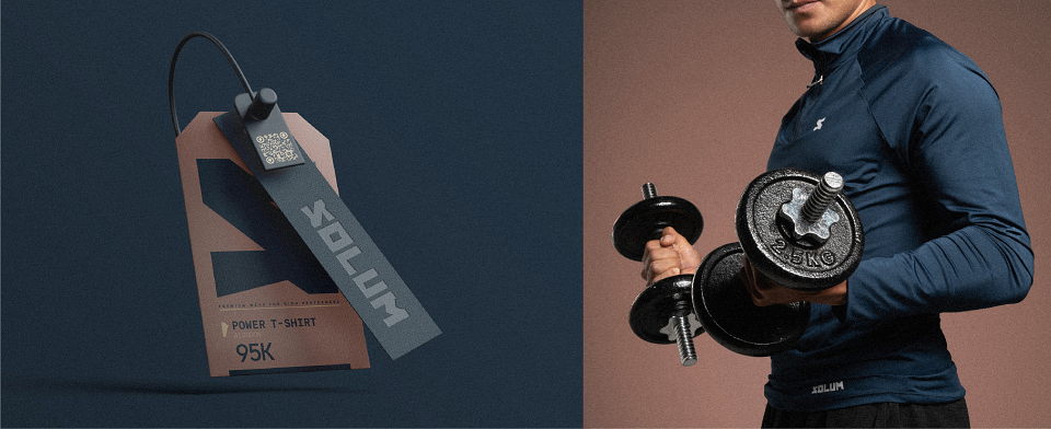
The color palette supports this language with a controlled, aspirational tone, reinforcing the idea of a product designed for performance, durability, and attention to detail. Every visual decision responds to a brand that understands training as a sustained process, not a fleeting impulse.
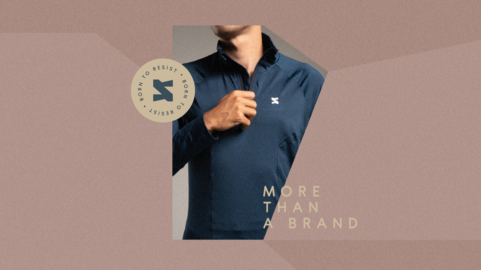
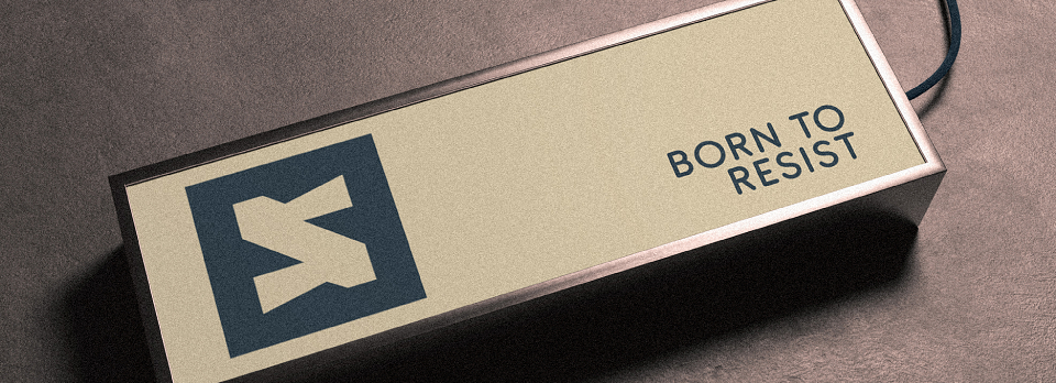
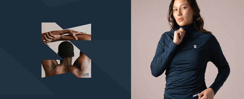
Finally, the S symbol, with its connected corners, encapsulates the brand’s collective strength. An energetic mark that represents the unity of a community sharing the same commitment, finding in the gym a place for connection, evolution, and resistance. The result is a coherent, functional brand system, built to grow alongside those who were born to resist.