Frank Hernandez
Art Director / Creative Director — Branding, Visua
ABOUT
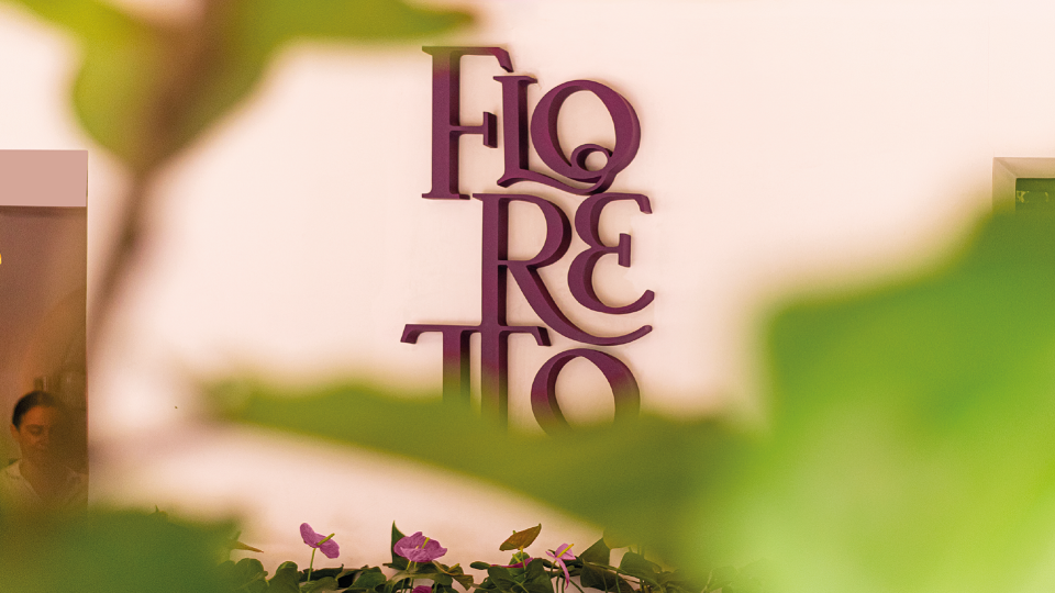
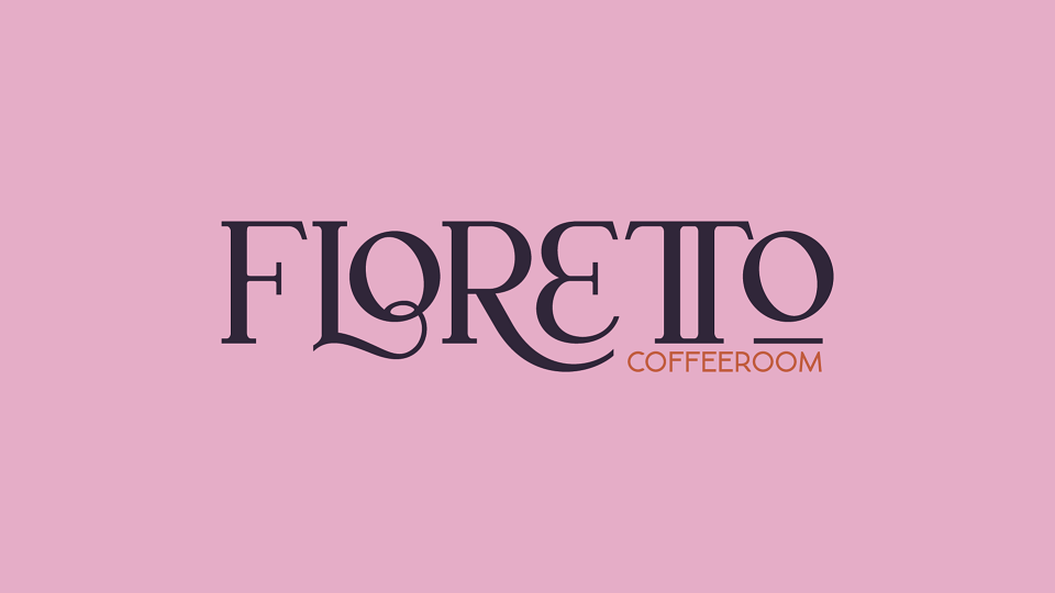
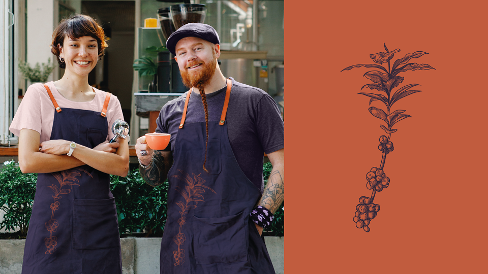
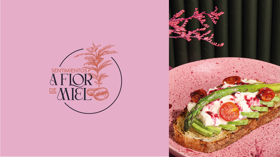
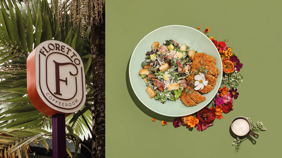
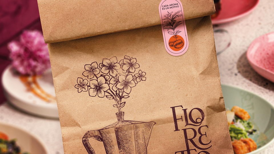
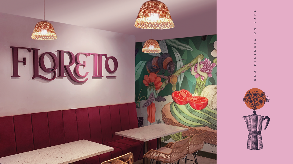
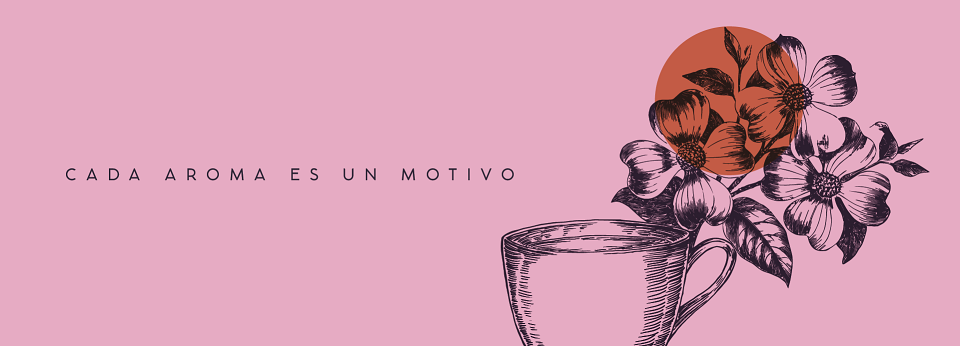
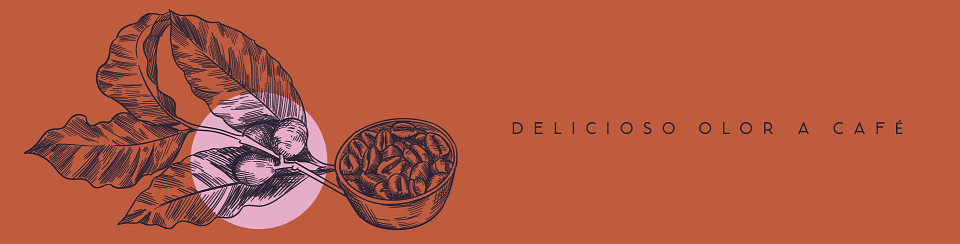
We began with the original concept, which was based on the location name, Via Primavera, and the sensorial sensations that our client wanted to transmit. The sum of these two words created our name: Flores (flowers in Spanish) + Cafeto (coffee tree) = Floretto.In the name 'Floretto itself, We embraced the letter 'R' with the letter 'E' to represent sought-after closeness & connection, and we joined the double letter 'T' to further reinforce it. In the graphic world, we paired the sophisticated brand, Floretto, with illustrated collages.