Fontsmith
London
ABOUT
The brief:
To create a straight-talking, authentic, flexible typeface for contemporary brands that would allow a variety of different voices within a single typographic system.
Approach:
Lead by Phil Garnham, the design team’s initial inspiration came from some of the characters in Danish dramas that were on in the early stages of the font’s development, like The Killing and The Bridge. Smart and a bit cool, but with a warm heart. For a good Danish name, Phil settled on Silas.
With FS Silas, the team created a versatile typographic toolkit that does the tricky job of enabling brands to communicate with different voices as part of a unified design language.
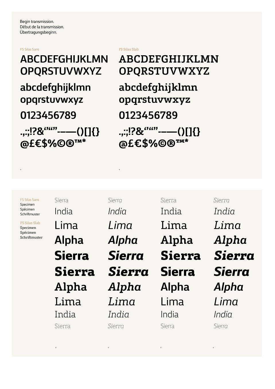
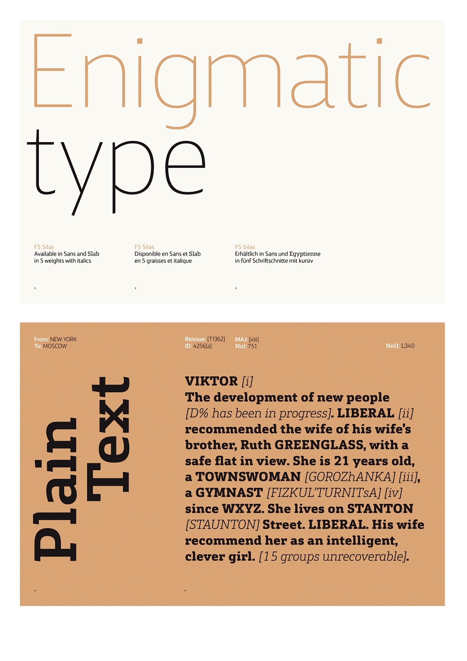
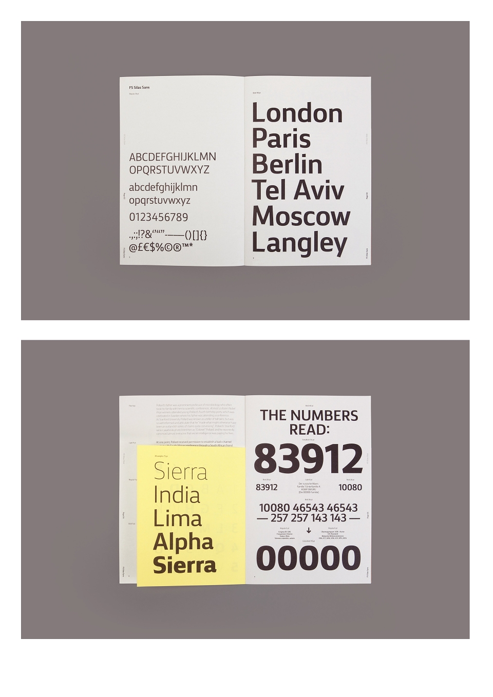
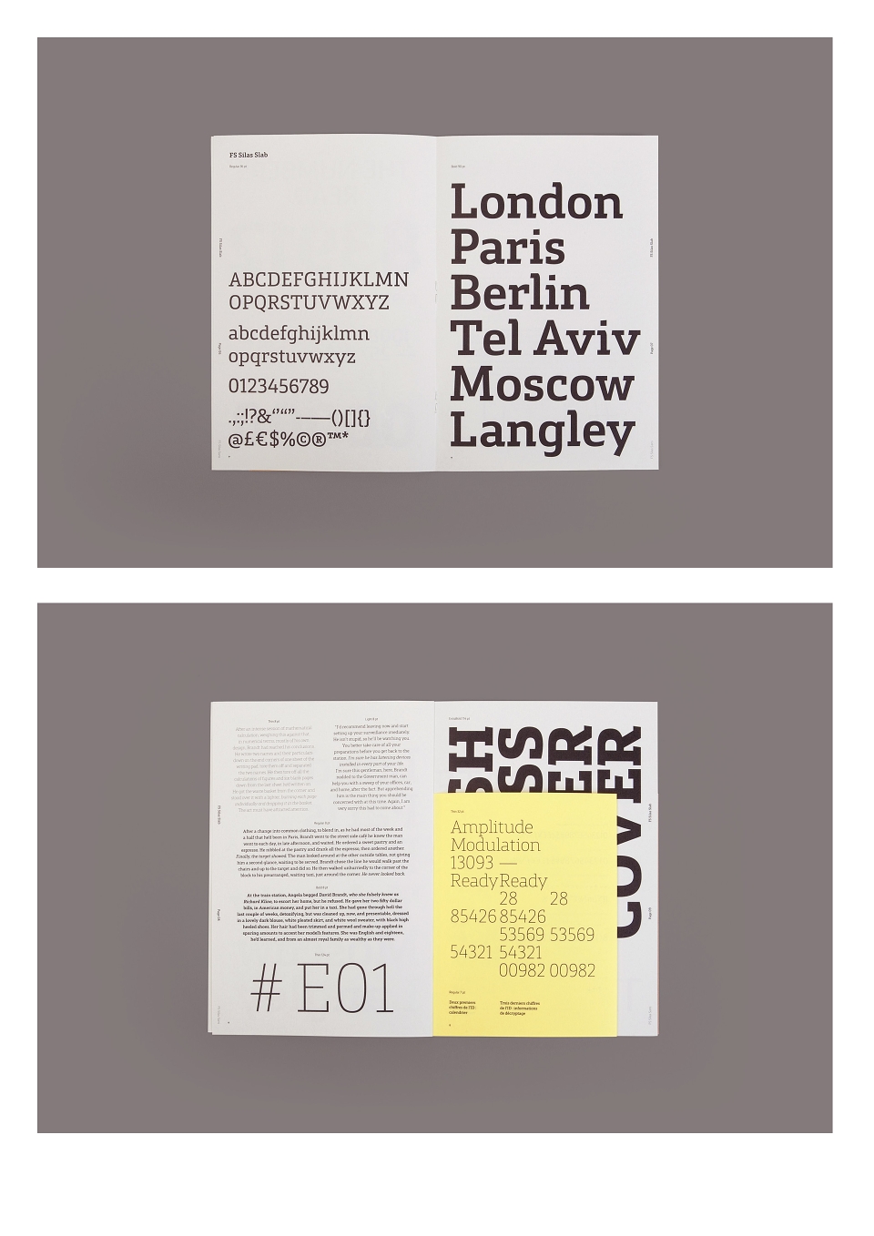
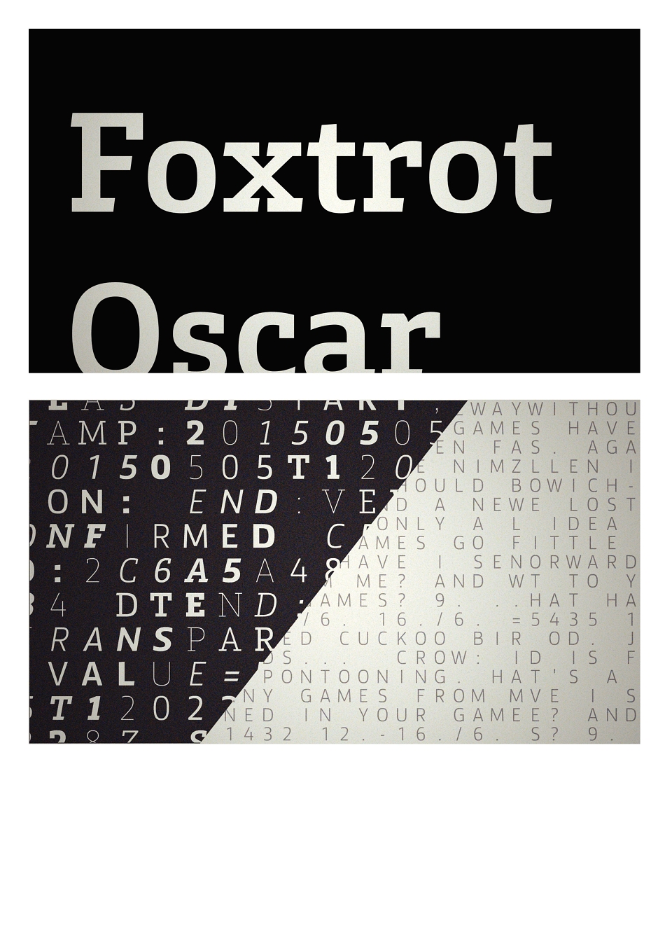
The typeface was designed in both sans serif and slab serif forms, and each version is available in 5 weights with accompanying italics.
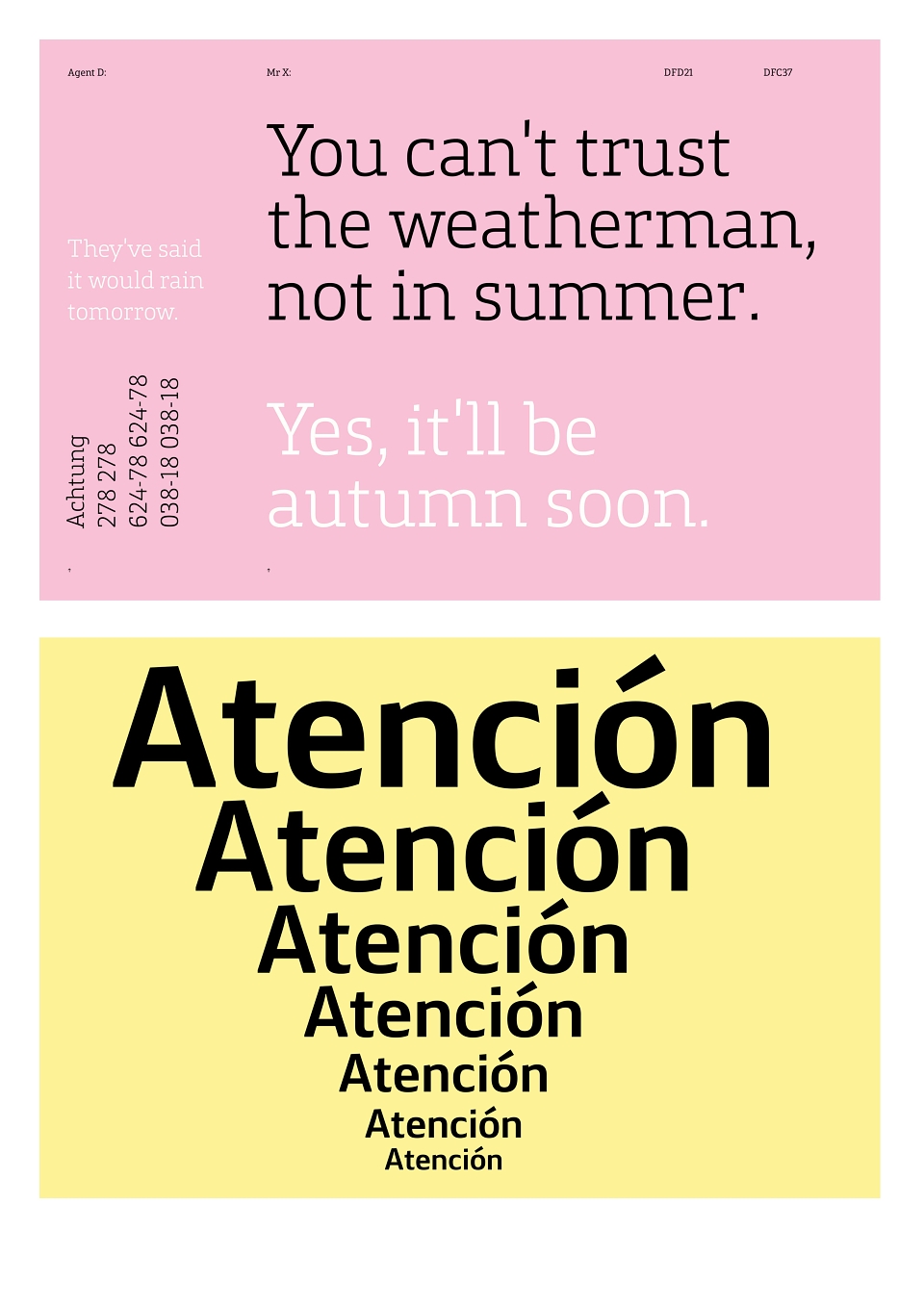
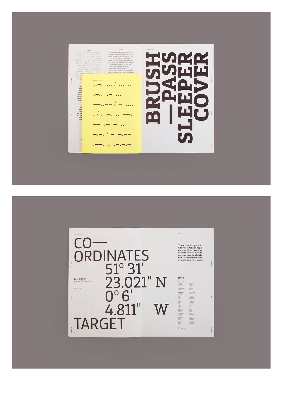
The various weights and styles are capable of displaying a wide range of personality traits, from elegant thins to powerful extrabolds and enthusiastic italics. The sans and the slab are true siblings, in the sense that they are drawn from the same origins, but display very different characters.
FS Silas initially appears unassuming - it goes about its work with a quiet industry. But on closer inspection, you begin to understand that there is more going on. Both versions make subtle use of varying angles across their respective character sets, giving copy a distinctive energy that compels the reader on. The sans fonts have a gradual sloping rise of the ascender terminals (l, i dot etc…) and cap terminals (uppercase H, E, T etc..) and there is a unique spikey-ness of the curved terminals of C, G, and S.
The team stuck with the theme of the sans by drawing forward angled slab serifs, as opposed to the square serifs that slab fonts usually have. That created an inner dynamism in words and sentences on the page, and a very distinctive, crafted character.
Result:
The resulting character is versatile, skillful and well-equipped to handle the range of tasks required. At once cool, calm and authoritative. On closer inspection, more nuanced and expressive. Simultaneously revealing and intriguing, there is a sense that every aspect has been considered, with a thorough detailing of the quality on offer.