Jones Knowles Ritchie
London
ABOUT
Background
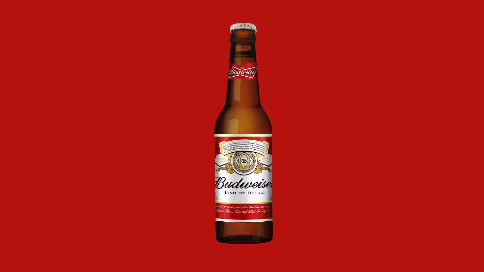
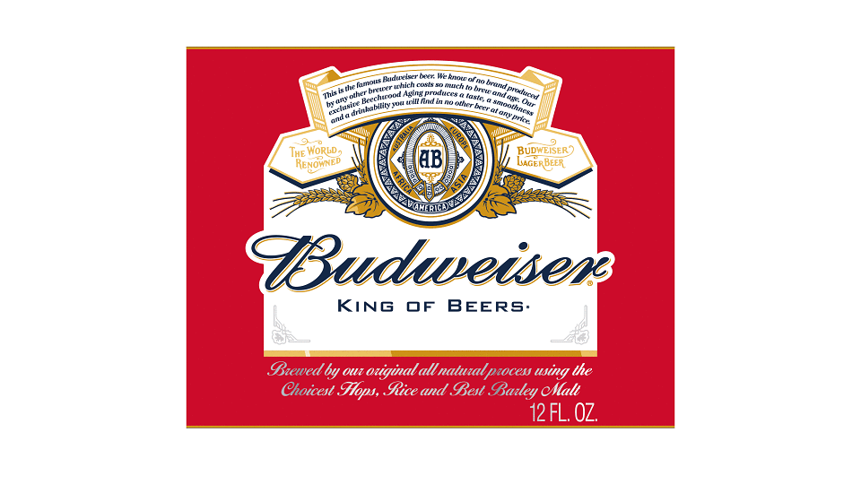
No American beer brand rivals the rich history and iconography of Budweiser. Since 1876, the brand has represented uncompromising commitment to quality, reflected through the craft and care that goes into brewing every beer.
The brief
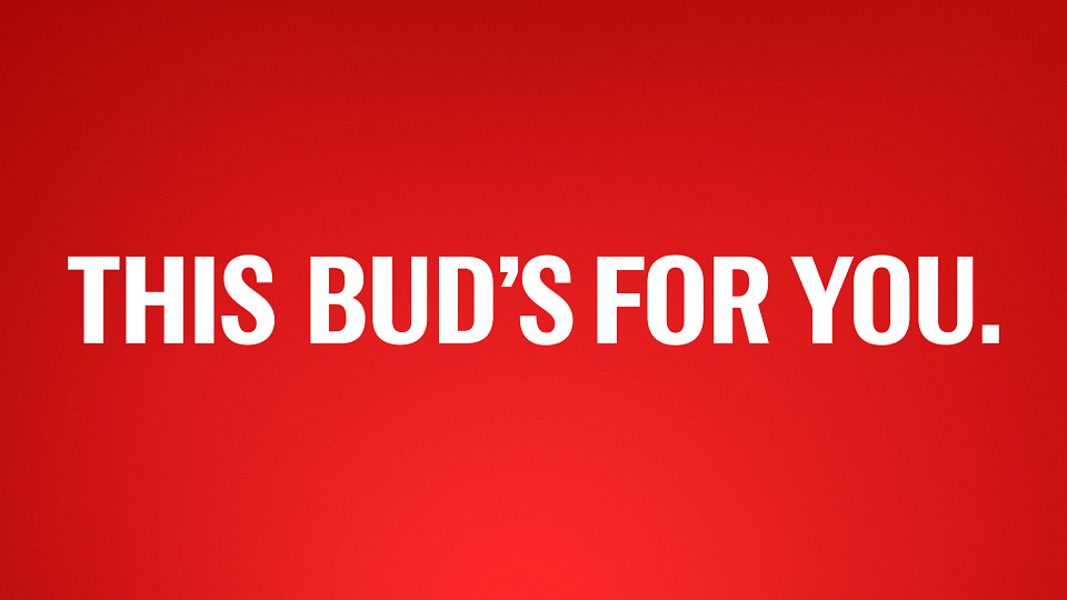
Our task was to align the brand’s design with the brand’s spirit. Budweiser partnered with our NYC team to refresh their packaging and visual identity.
The creative idea
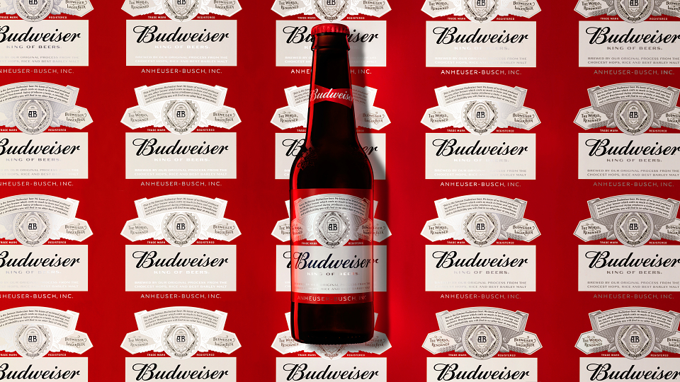
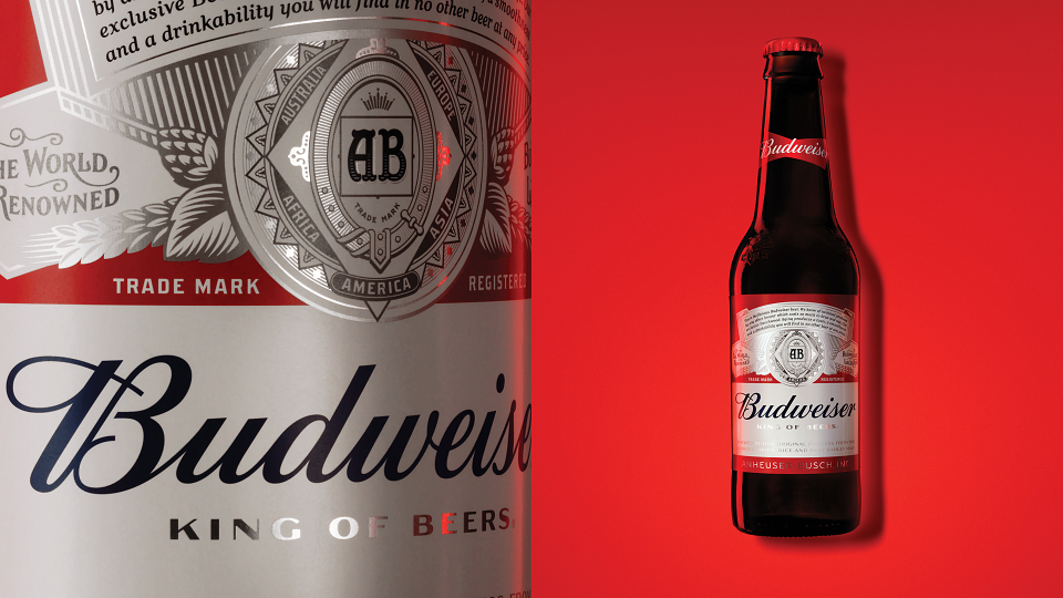
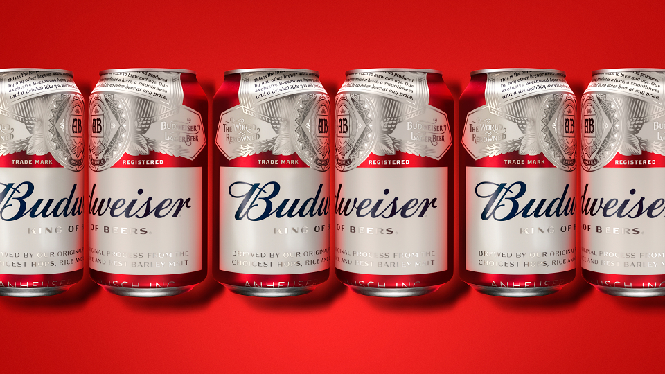
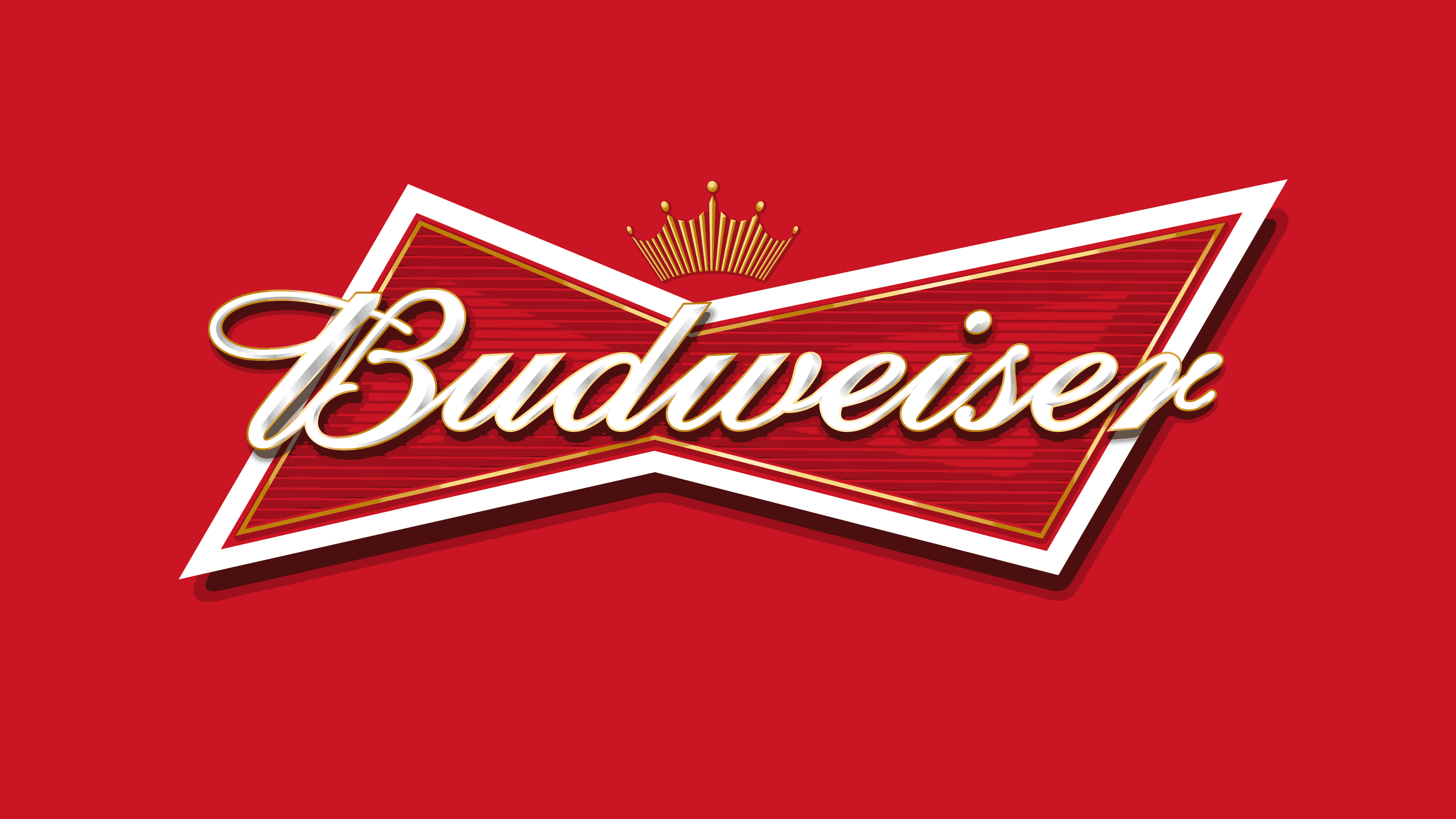
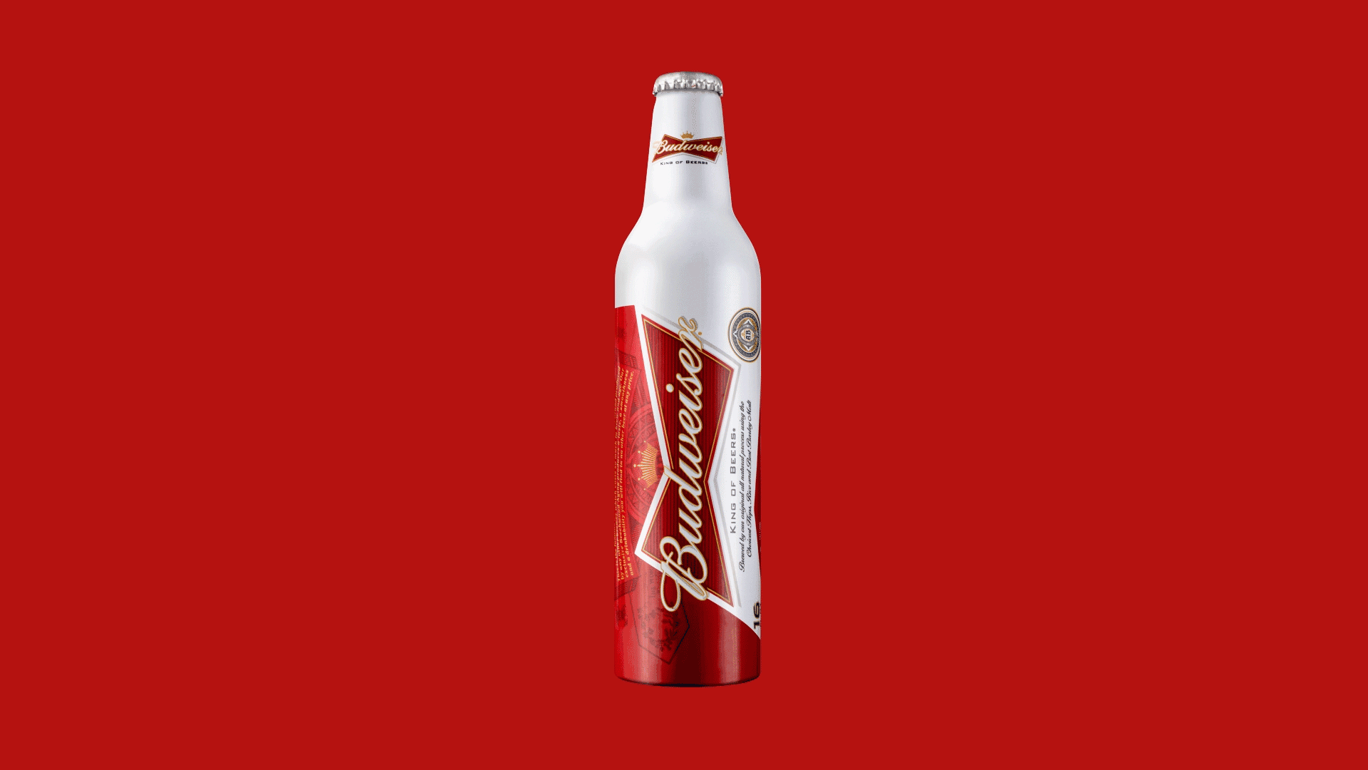
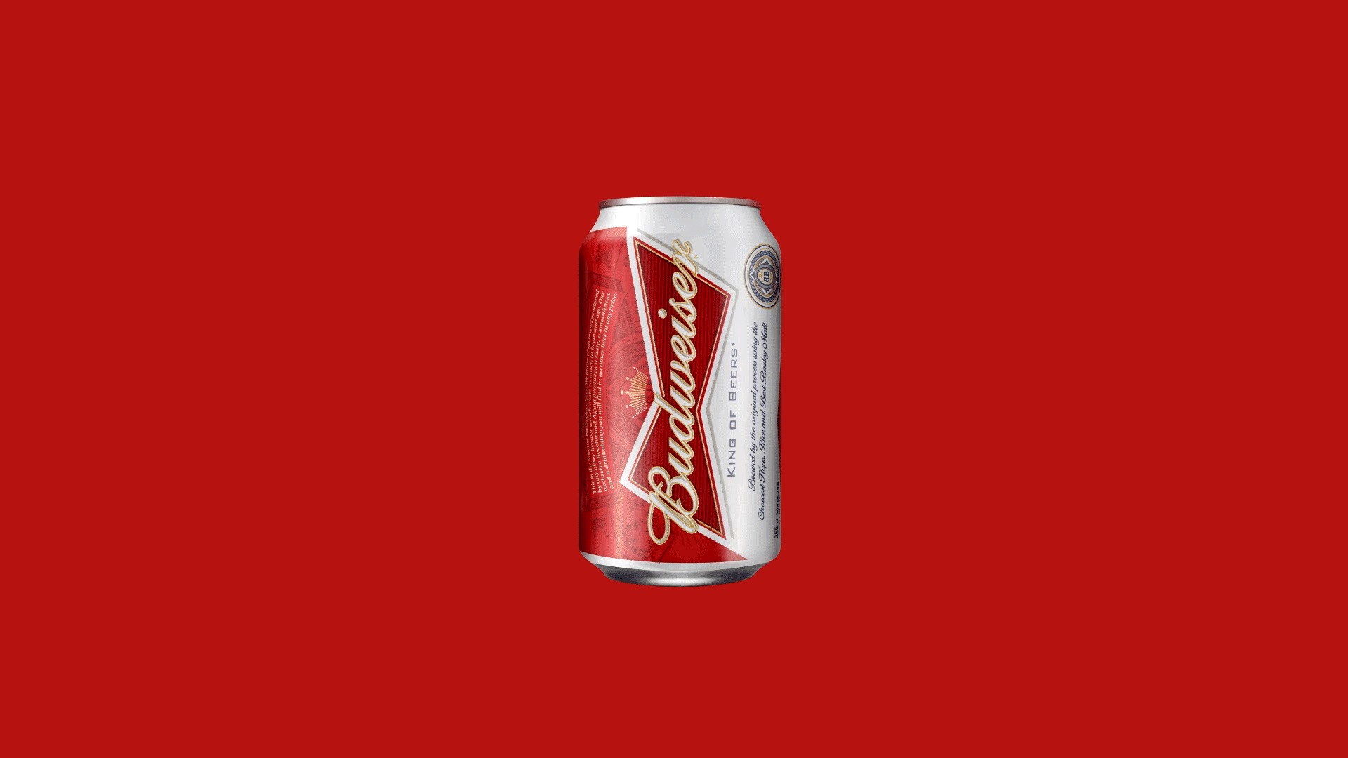
After an immersion in the Budweiser archives, then the team drew inspiration from the best parts of the 140 year design legacy. The idea was simple, sweat the details. Every element of the brand’s design language, including the simplified “Bowtie” logo, optimized packaging and two bespoke typefaces, were recrafted. The revitalized designs reflect a true commitment to craftsmanship.
Impact
The iconic beer brand seems to have found its voice once again through a bold and crafted design language. Through design we can drive reappraisal and brand truth for this true American icon.
AWARDS
Clios - Gold
Communication Arts Competition
LIA Award - Bronze
LIA Award - Silver
New York Festival - Finalist
One Show - Bronze Pencil
One Show - Merit
PentAward - Silver
MADEIT CREDITS
-

AB InBevClient
-

Jones Knowles Ritchie -

Amy MawMarketing Manager -

Ian RitchieExecutive Creative Director -

Tosh HallCreative Director -

Matt ParkesGlobal Marketing Director -

Augustus CookDesigner