brand&deliver
London
ABOUT
Pariti’s challenge is to stand out from an already saturated financial services market, to be a voice for simple and transparent finance and to improve real peoples lives with their services.
The identity needed to reflect Pariti’s approach and quickly establish them as a transparent, approachable finance brand that users can trust.
Working closely with the team from Pariti and based on an agreed brand strategy, we initially explored the brand identity with 4 separate design directions (Friendly, Elite, Youth and Minimal). Through research we determined that the ‘Friendly’ and ‘Minimal’ design direction was most relevant to Pariti’s brand values.
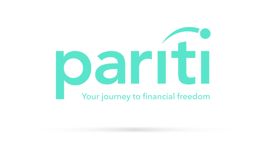
The colour palette is bright and fresh, which cuts through the usually dark or corporate colours of Pariti’s competitors. The wordmark is clean and simple, using a modified version of Avenir Bold for the characters; integrated with the Pariti ‘flying dot’.
The flying dot takes on a lot more meaning than just being a simple lower case ‘i’. The flying dot was created to represent the fact that Pariti is there to help you move from one situation to another, along your financial journey. ‘Your Journey to Financial Freedom’ became the brand slogan and is used alongside the wordmark and in all key messaging.
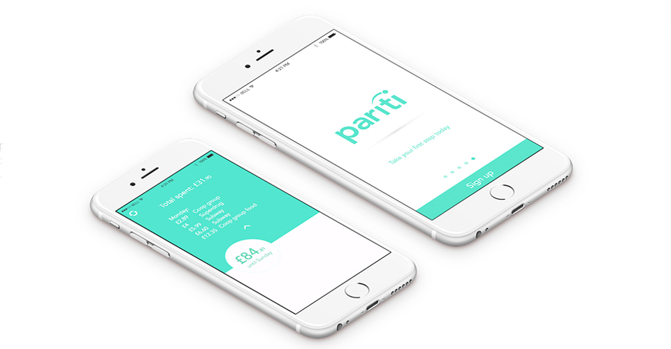
The ‘Pariti dot’ also takes a leading role in the app and is used to covey the amount of money available across your accounts. The dot acts a float, quickly visualising how much money you have above your minimum.
The new brand identity, website and app launched in October 2015 and has already seen substantial success in its uptake and customer brand recognition.
MADEIT CREDITS


Annual 2016 ShortlistPariti - Brand IdentityBranding
Project featured: on 26th November 2015
Contributor:
Invite
x3
brand&deliver has been a Contributor since 3rd May 2017.