
Google have reportedly spent five years developing the “One typeface to rule them all,” which will work not only across all devices, but across all languages. This holy grail typeface has been created as part of a collaboration with the typeface specialists at Monotype, and encompasses all written languages and scripts, including rarely spoken and dead languages, into one typeface family known as “Google Noto.” This family of typefaces covers more than 800 languages and 100 written scripts, and includes letters in multiple serif and sans serif across up to eight weights as well as numbers, emoji, symbols, and musical notation.
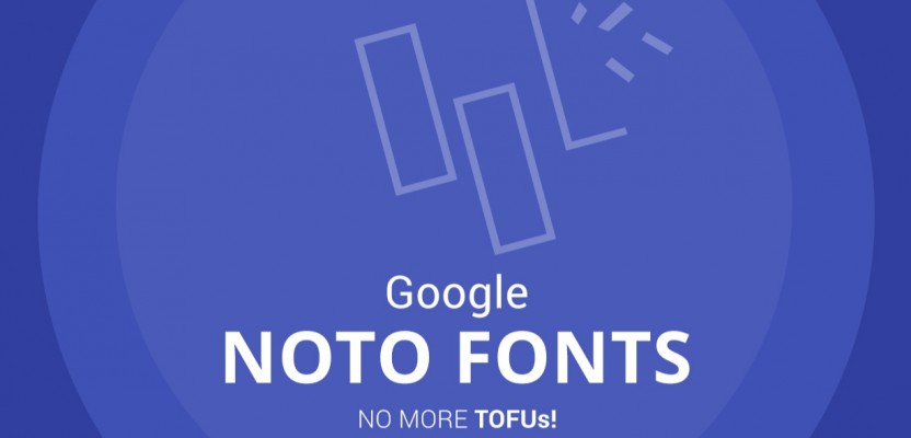
One of the main goals with Noto is to help ease global communications across borders, languages and cultures, but it's also been crafted to erase those dreaded blank boxes that often crop up on certain devices when a specific typeface isn't supported for one reason or another. When a computer is unable to display a font, it generally displays a blank box, which is colloquially known to those in the industry as “Tofu.” The name Noto is actually short for “No Tofu.” One of the hopes is that the typefaces will allow cultures to communicate digitally, where they haven’t been able to previously. When researching this uber font, Monotype and Google looked to the Tibetan language, which is notoriously difficult to translate. Entire libraries of writings and source material were accessed in an intensive research stage before the help of an actual Buddhist monastery was sought, to critique the font and make adjustments. The monks, who have studied many Tibetan manuscripts, were ideal experts to help evaluate Noto Tibetan.

Bob Jung, Google's Director of Internationalism, said: “Our goal for Noto has been to create fonts for our devices, but we’re also very interested in keeping information alive. When it comes to some of these lesser-used languages, or even the purely academic or dead languages, we think it’s really important to preserve them. Without the digital capability of Noto, it’s much more difficult to preserve that cultural resource.” Monotype's Linguistic Typographer, Kamal Mansour, added: “The aim of the Noto project is to provide digital representation to all the scripts in the Unicode Standard. That in particular is something that many different language communities could not afford to do on their own.”

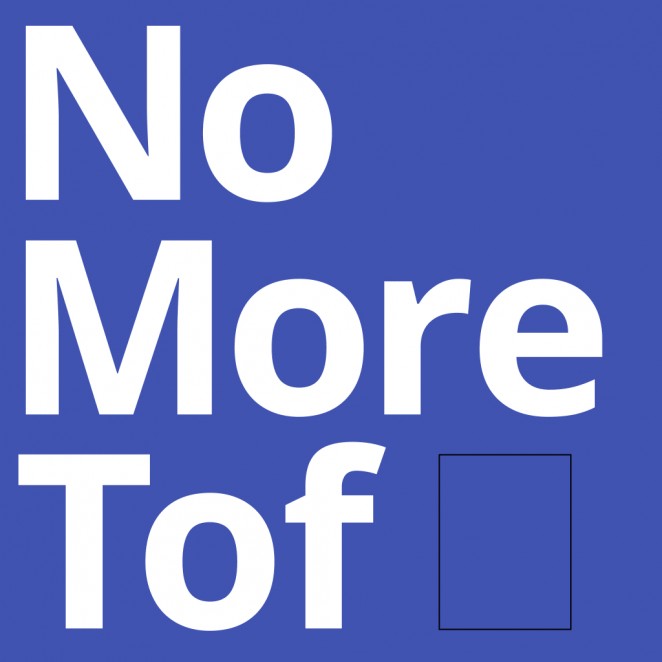
Monotype researched and digitally designed the characters, writing systems and alphabets for each Noto typeface, applying the rules and idiosyncrasies for individual languages to the fonts. External designers and linguistic experts were also consulted in the process, managed by Monotype. Hundreds of designers, linguists, cultural experts and project managers were brought in to work on the project, which is still ongoing. Currently, Noto consists of 110,000 characters and 110 writing systems, but to ensure consistency with Unicode (the system that defines the characters and languages that can be displayed and used within a computer coding system), Google intends to update Noto as new characters are introduced to Unicode, such as the recent emoji updates.
Google funded the project, worked on strategy, helped with design direction for major languages, and contributed design review and technical testing resources, but this is very much Monotype's baby, and what a beautiful baby it is! It's also entirely open source under an Open Font License, which means that any designer or developer can contribute to the design of the scripts. If you're interest has been piqued, you can download the family of fonts for yourselves over at the official Noto website. There's even a handy search bar that allows users to search for individual languages and regions. Or you can just download the whole shebang and experiment.
Benjamin Hiorns is a freelance writer and struggling musician from Kidderminster in the UK.