


A taxi service that has changed the way we think about taxi services, Uber has been a genuine phenomenon, but it's still finding its feet outside of the US, so it seems like an odd choice to instigate a complete company rebrand at this time. What's even more bizarre, is that this new identity has been designed by the company's own CEO Travis Kalanick, who worked with Uber design director Shalin Amin on the redesign. Kalanick says he and Amin have been working on the rebrand for the past two years and that he wanted to develop a new look that reflected their technology, as well as the cities the app serves. The idea of the design is to present users in different countries with customised colours and patterns, though anyone who has ever seen the underrated sitcom Community will probably see something else entirely.
“The old Uber was black and white, somewhat distant and cold. This belied what Uber actually is; a transportation network, woven into the fabric of cities”
Apparently centred around a theme of “Bits and atoms” to represent Uber's technology and human focus, the redesign was undertaken by Kalanick because he simply didn't trust anyone else to do a good job of representing his ideas. Although whilst the designs themselves were all done by Amin and the company Founder and CEO himself, patterns found across the background of the revised app icon and loading screen were devised by communications designer Catherine Ray, who was reportedly inspired by small square tiles in her bathroom. The new design has already been called out as confusing by numerous online outlets, and labelled a literal asshole by others, but honestly, I think it's a design that will grow on people as they slowly forget the brand's more formal and clinical former branding.

The new Uber logos
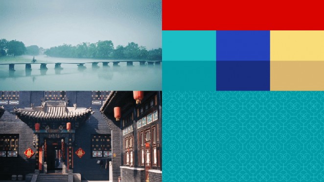
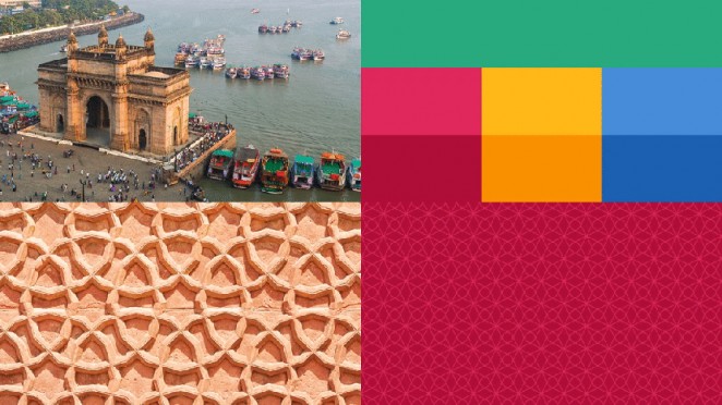
The changes are pretty severe. The recognisable “U” has been replaced by a circular motif for riders and a hexagonal shape on partners' devices. Both have a square “Bit” in the centre, which brings to mind a mobile phone sim card. Instead of black and white, Uber has opted for a colourful palette influenced by mood boards of architecture, textiles, scenery, art and fashion in the countries it operates in. Users in the different countries see a customised version of the identity to match these colours. The company also plans to roll out city-specific versions of the colours and patterns as time goes on. The typeface used for the new written logo, meanwhile, is thicker, more condensed and simplified.
“In Mexico, we were inspired by Mexican pink and the patterns in the local tiles; in Ireland, from the Georgian architecture and the lush greens”

Kalanick said: “The old Uber was black and white, somewhat distant and cold. This belied what Uber actually is; a transportation network, woven into the fabric of cities and how they move. Today we aspire to make transportation as reliable as running water, everywhere and for everyone. Our new brand reflects that reality by working to celebrate the cities that Uber serves. It also reflects a more substantial look as we too have matured as a company.”
Of his inspiration behind the design, he added: “In Mexico, we were inspired by Mexican pink and the patterns in the local tiles; in Ireland, from the Georgian architecture and the lush greens; and in Nigeria, from the ankara, which came up again and again because of its bright colours and beautiful geometric patterns. The team has spent months researching architecture, textiles, scenery, art, fashion, people and more to come up with authentic identities for the countries where Uber operates ”
Kalanick set up Uber with Garrett Camp in 2009, as a black car service for their friends in San Francisco. Its first logo was a red magnet designed by Camp, and the familiar greyscale identity the new logo is replacing was introduced in 2011. Any thoughts on the new Uber?
Uber: Celebrating Cities
Benjamin Hiorns is a freelance writer and struggling musician from Kidderminster in the UK who broke his Uber virginity just last week!


