Bold Monday – WeTransfer
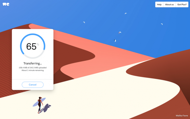

Online file sharing service WeTransfer has unveiled a bold redesign of its identity, logo and website, which includes the rater severe step of removing the “Transfer” from the brand name. This is the first identity revamp the company has done since launching in 2009, and it initially began in-house, with the company’s Creative Director Laszlito Kovacs drafting the concept and exploring initial options. Then, the team worked with Paul van der Laan from Bold Monday to work on the finer details, aiming to create a logo that looked well-balanced and exuded its personality at a small size. Outside the logo, the wider identity has also been revamped from the inside out to reflect how the service has evolved since 2009. It has a new colour palette, updated typography, a cleaner interface, a bigger message field that scales as you type, and a set of shapes (dubbed “particles” by the design team) to freshen up the look of the site, and a fresh set of spot illustrations. WeTransfer had previously enabled people to send each other digital assets by packaging up large files into downloadable, zipped packages. The service has now been changed so that files are no longer zipped, but are available as separate downloads and the rebrand aims to underline the new, less complicated and more streamlined service.
“We started with an empty canvas and a mission to create a symbol that captures the right personality, one that is technically well-executed, and can clearly be read as we” Thijs Remie, CP of Design at WeTransfer
The rebrand also comes alongside a completely redesigned website, which sees clearer navigation, a new transfer box and a new feature allowing people to download single files as well as groups of files. Side panels now pop out for navigation, which aims to enable users to access information more easily. They only cover half the page which lets users access the transfer box at the same time. The transfer box is also now bigger which lets people tap in longer email addresses and file names. WeTransfer Plus has been optimised, allowing users to personalise the backdrop of their page more easily, and providing a transfer overview panel showing the user’s list of transfers. The mobile site has also been optimised for viewing and downloading purposes, but to send files, users still need to use the iPhone or Android app. The new logo and website are currently rolling out online.
Bruce Mau Design – Asics Tiger
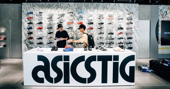
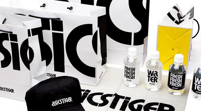
Bruce Mau Design has rebranded the Asics Tiger trainer identity by creating a bold graphic type that can be broken apart and layered over images. Bruce Mau Design CEO, Hunter Tura, said: “Conveying the richness of the brand’s heritage beyond nostalgia was a key element to us. Our challenge was to develop a brand identity that references the original legacy and reinforces ASICS Tiger’s global cultural impact.”
Coley Porter Bell – Sharwoods
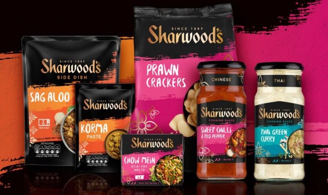
Premier Foods has revealed the new packaging design for the UK’s number one brand in Asian cuisine “Sharwoods,” hitting the shelves this month in the UK and internationally. The vibrant design has been developed by award-winning branding consultancy, Coley Porter Bell. Charged with increasing stand-out and helping consumers engage with the brand better, the agency used Visual Planning to identify an opportunity to take consumers on a culinary and sensorial journey with Sharwoods. Coley Porter Bell also developed a clear brand architecture helping navigation and allowing flexibility to accommodate future new product developments. The new pack design features free brushstrokes comprised of vivid colours with the product’s name written in a free-form font giving a sense of adventure, modernity and impact on the shelf. Each of the ranges, Indian, Chinese and Thai is enveloped in a rich palette and symbols that are associated with the corresponding country.
“We wanted to bring to life the confidence and delicious sensations of cooking Sharwoods” James Ramsden, ECD at Coley Porter Bell
Yilmaz Erceyes, Category Marketing Director, Savoury Meals at Premier Foods, said: “The magic ingredient CPB has is the unique way it approaches briefing, which is its Visual Planning workshop. This is where we create the design brief as a client and agency team together not with words but with images. I am convinced this was the key enabler for us to land on a brilliant new brand design for Sharwood’s that tested outstandingly well with consumers, significantly outperforming the previous design as well as the competitive set. I’m convinced this will be a key business driver for us in the new year.”
DesignStudio – Artfinder

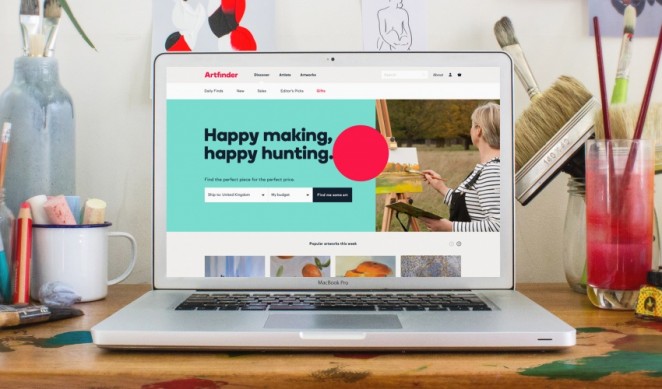
DesignStudio has redesigned the visual identity for Artfinder; a London and Miami-based online marketplace which offers artworks suitable for a range of budgets. The new identity centres on a bright red 'dot' symbol which looks to reinterpret the language of the traditional art world. Inspired by the classic circular stickers used at art galleries and auctions to identify pieces of art which have been bought, the colourful dot is seen in different positions across different platforms, including the website and print materials. It overlaps some imagery, colour blocks and text, while also changing in size and scale. DesignStudio has used A2-Type’s typeface “Boing,” to go alongside the dot, with the aim of making the identity confident and welcoming and to break from the “stale and cold visual language of the current art world. Based on the proposition of making art work and accessible to everyone, the brand’s tone of voice has been updated to include a simple and bold copy mechanic, featuring statements such as happy making, happy hunting. The new branding has now been rolled out across all touch-points.
“A striking colour palette, bold typeface and attitudinal tone-of-voice this brand amplifies that Artfinder is here to make a change. It is here to make art, work” DesignStudio ECD James Hurst
PB Creative – Lynx
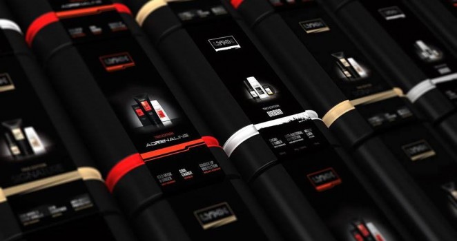
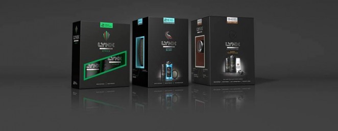
Lynx (Axe outside the UK) has revealed a new look for its seasonal gift packs for 2016, designed by branding and packaging consultancy PB Creative. The pack design aligns directly with Lynx’s global brand refresh, which was also developed by the design agency and was rolled out earlier in 2016. The brand’s key focus when developing the gift packs for 2016 was to bring the seasonal range in line with the core brand, leaving much greater synergy between the two. In line with the recently refreshed master brand, PB Creative has established a more aspirational range of gift packs across both core and premium collections, moving away from standard stereotypes to create a sense of excitement and intrigue for the recipient. The existing conventions of gifting have been challenged, using new cube-like formats for the core range as well as introducing sleeved tins for the premium packs. Pack imagery is used in place of the standard ‘pack window’, a feature that has hindered a more premium perception in recent years.
The packs re-establish the element of mystery, so after the wrapping paper is taken off, the recipient still has layers to explore before reaching the products inside” Ben Lambert, Creative Director at PB Creative
PB Creative has developed gift packs for both the base range of products and the premium range, which are currently being rolled out globally ahead of the festive season. PB Creative worked collaboratively with the Lynx global team to create, develop and design the three archetypes, with the agency responsible for creating the brand personality behind each variant. These qualities have been carried through into the seasonal gift packs for each variant, with photography and pack design reflecting each personality type. Alina Maatjes-Siletskaya, Global Brand Development Manager at Lynx, said: “PB went beyond applying the brand’s new visual identity to a single minded, premium and sophisticated design for Lynx gifting; their innovative thinking around modular packaging solutions have enabled us to manage the expanding complexity of our global gifting business.”
Hornall Anderson – Lindahls (Quark)

Lindahls, the leading Swedish quark brand, is launching a range of products in Waitrose, with design by Hornall Anderson. Quark, a type of fresh dairy product, is extremely popular in Northern Europe, and is seen as a huge opportunity in the UK. It is natural, high in protein and fat free, as well as healthy, which should chime with consumers who want to lead an active and healthy lifestyle. Mike Chatters, Sales Director at Lactalis McLelland UK, said: “Lindahls is a proven success in Sweden where is it the number 1 Quark brand. Our UK research has shown that consumers love the range and find it very differentiated due to the range of flavours and highly relevant due to its focus on health. The launch of Lindahls in the UK as a healthy dairy lifestyle brand demonstrates Lactalis’s commitment to innovation.”
Butterfly Cannon – Hennessy Fine de Cognac
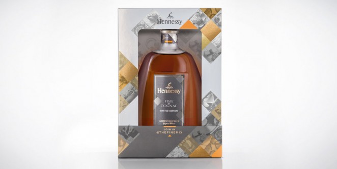
To celebrate the Hennessy Fine de Cognac blend’s unique mixability, Hennessy launched a digital campaign entitled #thefinemix, which invites consumers to share their own ‘Fine Mix’ lifestyle through Instagram. They then came to ButterflyCannon to create a limited edition pack that would both clearly communicate this campaign whilst serving as a highly impactful, premium, festive gift pack in it’s own right.
“Focusing on the aspects of Hennessy’s brand that complimented lifestyle photography enabled us to find a solution that led to highly desirable gift pack” Ben Cox, Design Director at ButterflyCannon
A metallic stock overprinted with a subtle cool grey ink gives the pack an elegant but masculine finish in keeping with its target audience, whilst the central motif of the design, a fragmented pattern of offset diamond shaped panels, is an impactful and contemporary interpretation of the more formal pattern used on Hennessy’s core packaging, it’s proportions adapted to reference the iconic square frame of Instagram photos. Executed in either de-saturated metallic grey tones reminiscent of vintage photographic plates or vibrant shades of Fine de Cognac’s trademark orange, the panels are used to present either informal but premium lifestyle photography or are picked out in embossed gold foil to add that extra splash of festiveness.
The Clearing – Tom Kerridge


Two Michelin-starred chef Tom Kerridge has released a retail range, branded by The Clearing, which has looked to capture the chef’s character and style. The range includes knives, pans and ceramics as well as enamel, wood and textile products. Kerridge has personally selected the products in the range. The Clearing Creative Director, Andy Howell, said: “One of the things Tom said when we first met, was he wanted his products to be Tom-proof (reliable and unmistakably British). The brand mark we created reflected this is Tom’s personal stamp of quality.”


