The Starbucks logo; something most of us absentmindedly encounter on a daily basis but have you ever stopped to peer at the mermaid logo which is emblazed across your morning latte? It's caused a fair amount of controversy since the brand launched in the 1970's owing to its somewhat racy connotations
Greek mythology depicts stories of strange half-women who are known as 'Sirens'. Some of these are half-woman, half-bird while others are half-woman half-fish, more commonly known as mermaids. According to the mythology, a mermaid's sole purpose in life is to seduce a sailor and then drag him down to the depths of his own watery grave with the empty promise of a 'good time'. Disney's 'The Little Mermaid' and the 1984 film 'Splash' both helped to scrub up the slightly seedy reputation of these underwater temptresses but did little to explain how exactly one procreates with a being whose nether regions resembles that of a fish tail.
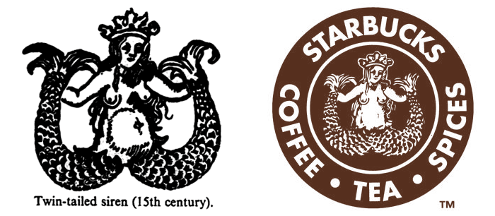
According to the mythologists, there is a breed of mermaid who has a tail which splits in two, which solves the logistical problems of mating. These creatures are known as 'Melusine'. The book 'A Dictionary Of Symbols' by J.E. Cirlot contains this engraving of a siren which was chosen to become the original Starbucks logo.
Below is the first logo Starbucks used in 1971, they flattened the scales on the siren's twin tails to cover up the suggestion of rude bits and also added a wry smile to her face in place of the frown. It was mounted on a brown background and presented in the format of a cigar band. Back in those days Starbucks stuck to selling coffee beans, tea and spices, although what this has to do with mermaids is somewhat of a mystery.

A second version of the logo was used from 1987 to 1992 and covered the mermaid's nipples and cleaned up some of the scruffy lines in order to make it easier to print.
A designer called Doug Fast was then given the task of rethinking the logo and toning down its sexual connotations. The text and the picture were both hand drawn so that it bent well around a circle (this was of course, pre-Photoshop) and the text was based on the Franklin Gothic typeface. Starbucks bigwig Howard Schultz was then presented the design in both red and green versions and chose the green version, during a re-brand, Starbucks removed the mermaid's boobs and shrouded her with green instead of brown but the suggestive fins-a-kimbo posture is still obvious.
In 2006, and 2008, Starbucks temporarily reintroduced the original logo onto paper hot-drinks cups. Its aim was to proudly comment on its heritage and 35 years of trading, but in reality all it achieved was sparks of public outrage at the sight of the bare breasts.
When Starbucks went to Saudi Arabia in 2000, the mermaid was removed completely, leaving only a crown in her place. By 2002 they decided to streamline all international branding and the mermaid returned to Saudi cups.
The newest logo, which has been used since 1992, has been cropped so that it appears our mermaid is holding something odd in her hands rather than propositioning someone in no uncertain terms. What we are left with is a rather ambiguous image which must spark a great deal of worldwide debate.
If you do happen to own a coffee jar or mug with the original cigar band logo on it, you might like to cash in on eBay where they can sell for hundreds of pounds. The only store still to sell merchandise with the original woodcut logo on it is the Starbucks headquarters in Seattle.
So there we have it, an interesting little anecdote to tell your colleagues the next time you are on the coffee run.
By Jessica Hazel
[email protected]