

This year sees the 150th anniversary of London Underground, and the exhibition at the London Transport Museum in Covent Garden celebrates the event in all its glory with a fantastic poster exhibition. With an archive of over 3,000, 150 have been selected – from little-known and even anonymous artists to graphic powerhouses including Edward McKnight Kauffer and Henry Beck.
The exhibition is an opportunity to leave aside talks of engineering works and industrial action, and instead remember the historic beauty, grandeur and wonder of our very own tube. These extraordinary posters encourage city dwellers to venture out to England’s green and pleasant land (well, Harrow and Watford, anyway); they offer an idyllic family life for commuters in leafy Golders Green; they advise housewives to do their shopping between 10am and 4pm to avoid the rush-hour crush; they tell us that the tube is the only choice for getting to the winter sales; and they tell us it’s cool in the summer and it’s warm and dry in the winter – unlike those open-top omnibuses.
I had so many favourites, but here are my top ten most striking posters. The exhibition is on until October 2013, so you’ve got plenty of time to while away an afternoon:
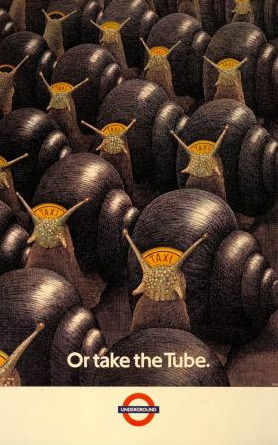
1) Or Take The Tube – Nick Hardcastle, 1987:
Even when the traffic wasn’t even as bad as it is now, taxi users were being lured away from the supposedly gridlocked streets in favour of a quicker means of transport. This poster won an award for best conceptual illustration.
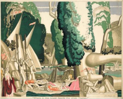
2) Where Is This Bower Beside The Silver Thames? – Jean Dupas, 1930:
With the title taken from a poem by Robert Bridges, I like this one because it’s so decadently romantic, with touches of Salvador Dali. Dupas was already well known for his Art Nouveau and Art Deco posters.
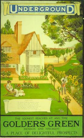
3) Artist unknown, 1908:
My local stop is Golders Green in not-always-sunny Northwest London. But judging by this idyllic image, it was all flowers, freshly cut grass and lemonade on the lawn out in the ‘burbs.
4) London Zoo – Abram Games, 1908:
Equally bold and using the deconstructed London Underground logo, this is ingenious and endearing in equal measure. It also illustrates very well Games’ artistic philosophy, ‘maximum meaning, minimum means’.

5) International Advertising Exhibition – Frederick Charles Herrick, 1920:
An advertising historian’s dream, Herrick’s design is tearing up the polls with exhibition visitors who can vote for their favourite at the end. How many famous figures can you spot? No prizes for getting Michelin Man…

6) Speed Underground – Alan Rogers, 1930:
Another Art Deco poster, and another that uses an adapted and deconstructed version of the London Underground logo. The bold lines, colours and images suggest the tube’s supreme efficiency.

7) Keep Your Personal Stereo Personal! – Tim Demuth, 1987:
Ah, the Eighties; you’ve gotta love ‘em! The tinny annoyance of other people’s iPod headphones is just as irritating as ever, but it was worse back then with those big foam earphones which did little to muffle the sound leakage. And with Wi-Fi now available on the Underground, is it only a matter of time before we’re all Skyping each other on the go? Just one flaw with this eye-catching poster; within weeks of being put up, most had been stolen!

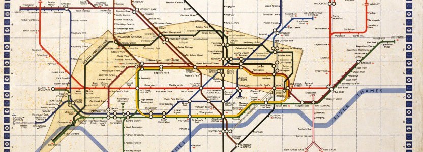
8) Map of the Underground – Henry Beck, 1933:
What collection of Tube poster favourites would be complete without the inclusion of Henry Beck’s groundbreaking topographical map? Look at New York’s subway map, or that of the Paris Metro; this is still miles easier to follow. Genius.

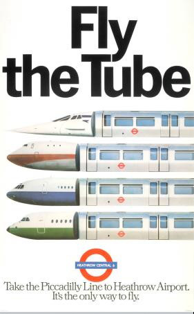
9) Fly The Tube – Geoff Senior and agency Foote, Cone and Belding, 1979:
By the late Seventies, the posters were no longer designed by individuals but by agencies, and they needed to work alongside TV and radio advertising. With posters in decline, this prize-winning design by Geoff Senior was an exception.
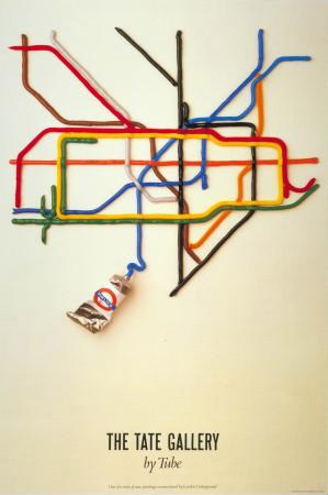
10) The Tate Gallery By Tube – David Booth and Fine White Line, 1947:
And so we conclude with the best-selling tube poster ever made. Originally it was mocked up using coloured toothpaste, with the final design being moulded into plastic for the artwork.
What a great collection; I urge you to go along. And when you’re done with the posters, you can go downstairs and drive a virtual tube train!
Follow me on Twitter
Connect with me on LinkedIn


Rick Byrne May 1st, 2013, at dawn
Actually DavidBooth designed that poster in 1986 not 1947.