by Magnus Shaw.
Perhaps surprisingly, there's only been an official ITV logo since 1989. Until then, the network was divided into autonomous regions, each with their own brand. If you're in your thirties or forties you'll remember your own - Thames (and then Carlton) in London, ATV (and then Central in the Midlands), Anglia in the east, HTV in the west - and so on.
At the close of the eighties, the channel began to rationalise and centralise their operations and that involved an increasing amount of programming appearing under the ITV banner, which required the deployment of a generic logo. Since then the company's appetite for re-brands has been voracious. The latest iteration is on the cusp of making its debut.
The progress of the ITV visual brand has been more revolutionary than evolutionary. Allowing for some tweaks at the close of the nineties, each revisit has seen the incumbent design completely jettisoned and re-built from the ground up. I count six new logos in 23 years. This may not sound especially fickle, but when one considers Virgin are still on their first mark, introduced in 1972, it begins to appear rather extravagant.
The first ITV logo, created by English Markell Pockett, was quite a grand affair. Possibly a touch intimidated by the BBC, the mark uses upper case letters and a 'sail' device which was adjusted to represent each of the regions, which were still recognised as independent providers. Despite its somewhat austere appearance, it lived until 1998 when another upheaval in the network brought an almost complete end to the regional arrangement.
![]()
At this point it was felt the channel needed to take itself less seriously and appeal to younger audiences, so a new brand was sought. Again English Pockett was responsible, developing a flattened, lower case, yellow and blue device. Although the brief was to position the broadcaster as 'friendly', 'informal' and 'youthful', the font was quite mechanical, lifted only by the bright colours. Perhaps that's why this version lasted only four years, when it was softened and rounded in 2003.
I get the feeling ITV were never very comfortable with this logo. It was only another two years before it was adjusted further and the characters placed into individual boxes. The rationale for this wasn't clear and to be honest, it improved the mark's appearance very little.
![]()
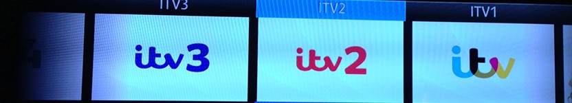
By now ITV was a proper multi-channel broadcaster to rival the BBC. Audience reaction to the existing logo was poor and it was felt another tweak would be fruitless. So, on 16 January 2006 a whole new visual brand was unveiled to bring ITV1, ITV2 and ITV3 in line with ITV4. For the first time, the project embraced the news and sport divisions and a new consultancy was handed the brief. Red Bee Media built the basics of the branding we see on screen today.
The network's name appeared in lower case, sited in a rounded off box. It was unofficially suggested the look achieved what had been attempted in 1998: a friendly feel that was simultaneously fresh and crisp. An extra rectangle was also added to the right of the channel name, allowing single words or phrases to sit between the two devices. For my money, ITV had finally arrived at an impressive solution to their branding dilemma. The deceptively simple design was actually attractive and brought enough flexibility to encompass the company's rapidly expanding service. In fact, the minor adjustment in 2006 (ten months after the last launch!) wasn't a bad call and even enhanced the mark.
Nevertheless, there is obviously something restless in the psyche of ITV's marketing division because here we go again. The strong, familiar brand we are now accustomed to and which genuinely works, is in its dying days. We are about to be greeted by yet another re-build and the forthcoming logo was presented, off-air, on 16th November. It was created entirely in-house and here it is:
![]()
Group Director of Marketing and Research at ITV, Rufus Radcliffe has said:
"In an ever more crowed market place, both domestically and internationally, the need for a modern, flexible brand identity that connects with our viewers and customers has never been more important. Big, bold and creatively ambitious, it will be true to our DNA as a brand at the heart of popular culture."
Right, thanks Rufus. I'm not sure that tells us anything we haven't heard at every brand launch in the modern era. More pertinent would be an answer to the question 'Why?'. As we saw with the Olympics identity, the most common reaction to a new logo is hostility. People are resistant to change and tend to like what they know. The value in a logo lies in its recognisability and association with an organisation's values. I don't perceive ITV as doing anything so wildly different in 2013 that it demands an expensive re-brand. And by expensive, I don't just mean financially costly, but in terms of audience confusion.
Actually, I don't particularly dislike the new look (although it's not stunning). I just think it's wholly unnecessary, particularly when the broadcaster has dragged us through so many brand overhauls in the last two decades.
But this is ITV, so try not to get used to this new device because they're bound to change it again with unseemly haste.
Magnus Shaw is a copywriter, blogger and consultant.
www.magnusshaw.co.uk