French architect and designer Jug Cerovic has unveiled a new design proposal for the London Tube map as part of his INAT project, which aims to standardise metro maps around the world. His Tube map proposals uses bright shades to highlight high-frequency services (such as the London Underground and Docklands Light Railway) and lighter tones to show other services such as Overground and Rail. It also features London parks to help with orientation, and inside the Circle loop, where the Underground network scale and the walking distances are related, the schematic map is close to geography.
Jug Cerovic has unveiled a new design proposal for the London Tube map as part of his INAT project, which aims to standardise metro maps around the world
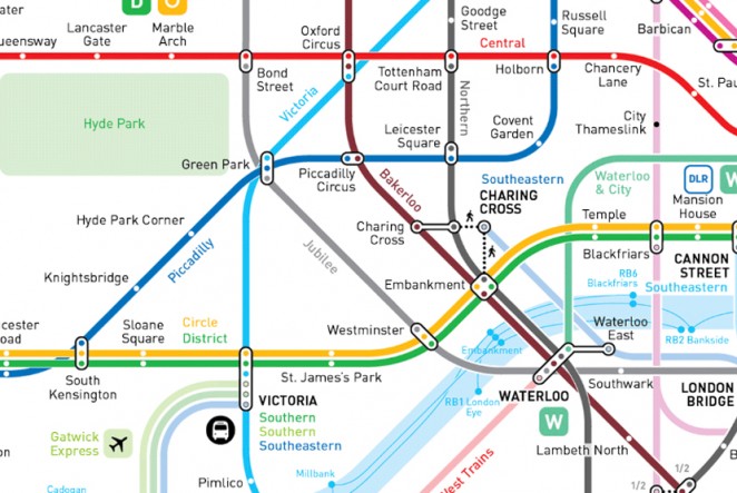
Honestly, it's a lot cleaner and cleaner than the generic map, so we hope Transport for London take note! To draw attention to the fact that the classic tube map could really use a little rejig, we've collated 5 more potential propositions. Of course, not all of them would necessarily work, but that doesn't mean we can't wonder. What if? You can see Cerovic’s map in full HERE, as well as his similarly styled INAT maps for cities including New York, Paris, Mumbai and Tokyo.
The Night Map

The Night Tube is a plan by Transport for London to introduce a 24-hour service on certain lines. It was set to start in September this year, but has been delayed following strike action. Although a new date for the Night Tube is yet to be announced, TfL has already released a Night Tube Map, which shows the services across different the lines that it is planning to run 24 hours. The Night Tube map uses the standardised Tube map system but is coloured a fittingly nocturnal blue and also features a nifty night-owl icon.
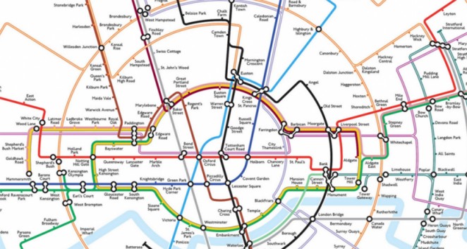
Geographically Accurate Map

One of the most common proposals for redesigning the Tube map is to create a more geographically accurate map. When Harry Beck created the now iconic Tube map design in 1933, he purposely rejected any form of geographical or distance accuracy, instead choosing to strip the network back to a diagram of coloured criss-crossing lines to keep things neat and easy to follow. There have been various attempts since then to introduce a more geographically accurate map, and earlier this year it was revealed that TfL itself actually holds and updates its own geographically accurate Tube map. It's easy to see why they've decided not to put it in wider circulation.
Digital Map

The 2011 digital tube map update by Mark Noad started with the idea of creating a more geographically-accurate map, but evolved into a more logical and ordered beast. It also uses a series of filters, so viewers can choose to see, for example, walking links between stations or average journey times. Noad said of his design, which he is constantly updating: “Harry Beck’s original is one of the greatest designs of the twentieth century but, although the current diagram still follows the same principles, they have not been applied with any great care. As a result, I do not believe Beck would have been happy to put his name to the current version.”
Circular Map
In 2013, Dr Max Roberts proposed a Tube map design based on the concept of concentric circles, which he felt makes it easier to comprehend, as it grounds the map in familiar shapes. Frankly we're not so sure, but to each his own! The map starts with the Overground line as a circular shape and aims to fit the other lines into the same system. Roberts says the concept was fun to create, but doesn't think he'll be sending it off to TfL anytime soon.
The Current Map
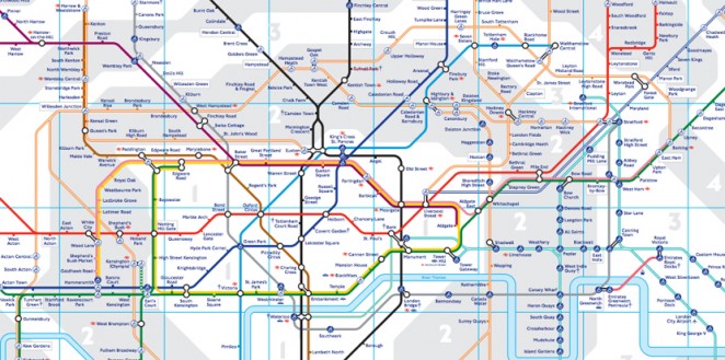
TfL’s current Tube map is based on the original 1933 design but, these have changed reasonably significantly in the past decades. As well as having to add in new lines over the years as they've been built, TfL’s designers have also experimented with different design concepts, including briefly removing the River Thames entirely from the map in 2010. The current TfL map is now available in several different official versions. As well as the Standard Tube Map there are also maps showing step-free stations, toilets, lines on which you can carry your bicycles and an online real-time disruption map. It's the perfect blend of classic and modern, and works very well indeed, but we certainly wouldn't mind giving Cerovic's map a trial run!